General guidance on font sizes

Hi,

I’ve looked at various other posts on the forum and online and can’t seem to find a good guide as to what is “standard” good practice for font sizes on a site.

My site (www.modernlovelongdistance.com) has a lot of blog articles that I want to be easily readable on a mobile, and I’ve noticed lately that the font size of the body text in the posts is too small.

I can change it by upping REM to 1.4, but that upscales all the other stuff on the site as well. it also messes up the alignment of the meta for the posts, and in some cases cuts off the “READ MORE” link in masonry style.

Is there a “start here” type of worksheet on font styles in X? A guide that clearly explains when to use scaling versus stepped, and what you should set your sizes to as a baseline before you start playing around?

THanks,
Lisa

Hey Lisa,

A good starting point to look at is the info of the options.

Next, you need to understand how the px, em, and rem units work. Here’s a guide.

1.4 REM is huge if you have a big root font size.

When setting your font size for different devices, switching to different responsive views would be helpful.

Hope I’ve given you the information you need.

Thank you. I’ll check this all out today. Have a good one.

Glad we could help.

Cheers!

I’m having the same issue. I’ve read through everything as well. Here is what I don’t understand.

  1. In the options for typography you outlined where you can assign stepped or scaled. It allows you to set either px or em, so where is the rem here? where would I set that?

  2. When it comes to stepped, it says I can set the font size for each breakpoint, but the fields just say xs-xl, so I don’t understand how these relate to the breakpoints, shouldn’t it just tell you the device sizes or allow you to set different sizes for each heading level etc based on each breakpoint ?I’m guessing the best route is then to use em here then? I’m confused how setting one set of font sizes translates to all the heading levels etc.

  3. For scaling, i don’t really understand, I set the smallest to biggest range and it just bases the relative scale between the two values for each heading and text resizing?

  4. If I add an element, like say a feature headline, I then have to set the sizing in there again, I can’t just have it take my default “h1” sizing for example and this over-rides anything else. So I tried to assign rem here and played around and couldn’t see any change in responsiveness

So, say I wanted my h1 to be 4em on desktop and 2em on smallest mobile, how do I achieve this? Really I just want to ensure my titles arn’t running off the page as they are currently on smaller devices.

I really tried to understand this, but it just seams all very confusing still. I feel like it would have been easier if you could assign for each heading level the responsiveness and then when I add a say “feature headline” I could assign that specific template too. I don’t need all my fonts resizing, just the headings, especially the h1, h2…

Thank you in advance

1 Like

Hey @reform,

Thank you for your feedback.

1.) There is no REM unit because it is not suitable for the root font size because of how it works (Relative to font-size of the root element).

2.) The sizes correspond to the Preview Sizer. It is best that you use the Preview Sizer when setting the font size for different screen sizes. I’ll forward your feedback to our issue tracker though so our development team could be made aware of the confusion. Regarding the heading sizes, I’ll explain the in a bit.
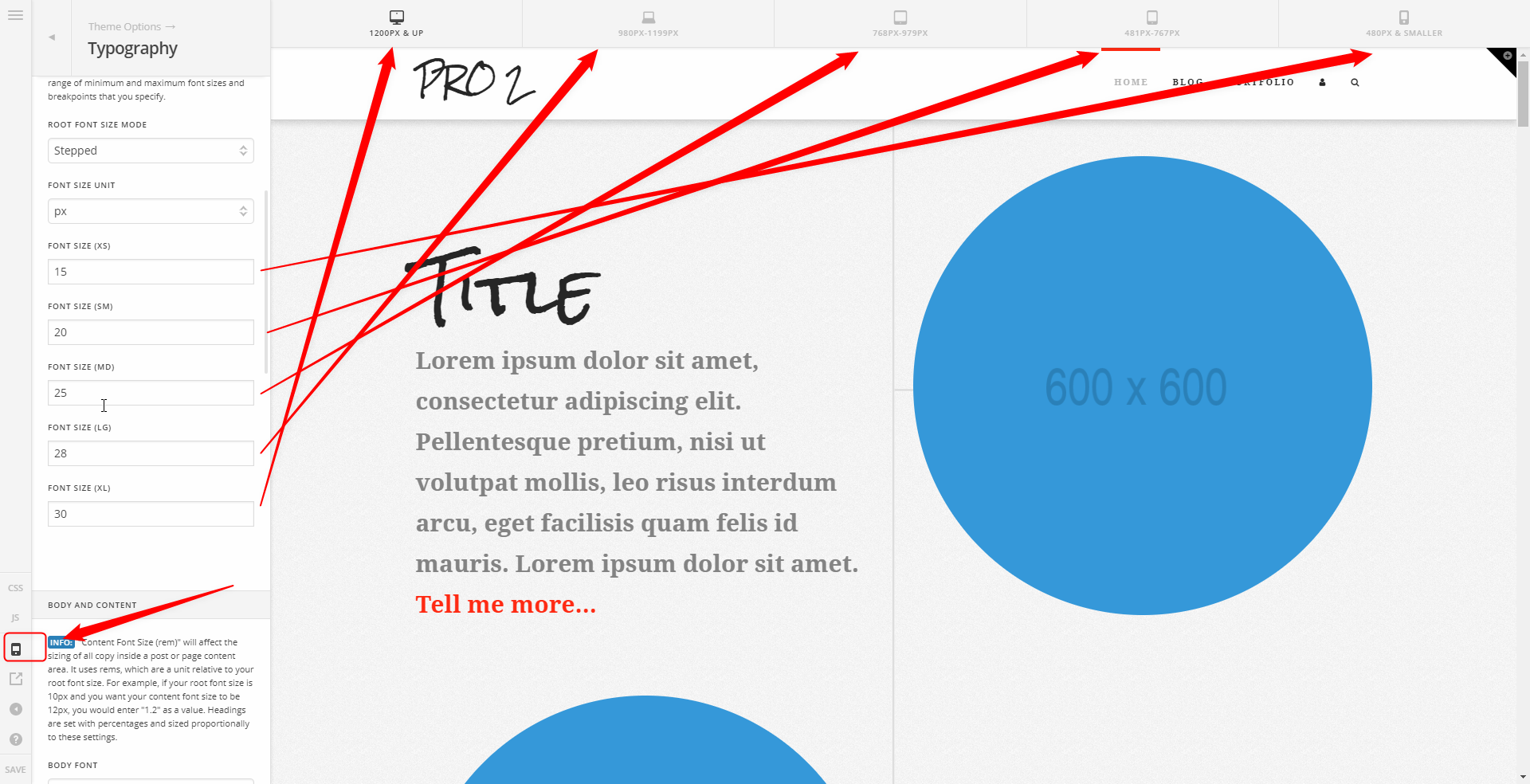
3.) Yes, the heading size is relative. There is no option to set a size for each heading so it will dynamically base your heading font size on the scaling root font size. This is best tested if you resize your browser window. You will see that the font size will shrink smoothly instead of shrinking in steps. See https://youtu.be/Vc3Qkb-bUyE

4.) The Classic Feature Headline does not have a unit based sizing. It only has a Looks Like option which takes the heading size values from the stack’s CSS (more on this below). I’m confused why you can assign REM unit to your feature headline. Maybe you’re referring the the Headline element?

Assigning a specific font size for each heading level has been submitted as a feature request. Maybe our development team could have a solution for this in the future. But for now, you need to understand that he heading sizes are predefined and are set in the stack’s CSS. Here is the code taken and unminified from Integrity CSS

h1,
.h1 {
    margin-top: 1em;
    font-size: 400%;
    line-height: 1.1
}

h2,
.h2 {
    font-size: 285.7%;
    line-height: 1.2
}

h3,
.h3 {
    font-size: 228.5%;
    line-height: 1.3
}

h4,
h5,
h6,
.h4,
.h5,
.h6 {
    margin-top: 1.75em;
    margin-bottom: 0.5em;
    line-height: 1.4
}

h4,
.h4 {
    font-size: 171.4%
}

h5,
.h5 {
    font-size: 150%
}

h6,
.h6 {
    font-size: 100%;
    text-transform: uppercase
}

As you can see, h1’s font size is 400%. h2 - 285.7% and so on. That is by design. Because it is percentage based, it is relative to the size of its parent element. Please see https://developer.mozilla.org/en-US/docs/Web/CSS/percentage for more details. Take a look at the Font Size example there. Now the parent font size in X / Pro is the root font size. So you only need to change the root font size and the headings will be resized based on it.

To your problem:

Understanding how Typography works above, you will need to set the Root Font Size Mode to Stepped, use EM for the unit and set Font Size (sm) to 2 em. To ensure your titles aren’t running off the page as they are currently on smaller devices, lower the font size until the text stays in the page. It is best that the Preview Sizer is enabled when working on this.

Let us know if this is still unclear or if I misunderstood your questions.

Thanks.

Hi christian_y!

Thank you very much for your detailed response. I can’t say more about how phenomenal your support has been throughout my experience as an xthemer/pro user.

So this does really help.

I think where i am still confused which you talked about above. My mistake I said “feature headline”, I meant “classic custom headline”.
is whether I should be using the “classic headline element” or the “headline” element From what you are saying, it seams that the best solution is to use the classic custom headline element. I just thought it was maybe better practice to start using the new “headline” element and all it’s jazzy options, but where I am confused is how to assign the font-sizing there to reflect the default sizing as well as the responsive stepped settings (as it seams to override any defaults with what I assign size wise for the headline element.

So if I understand correct, these would be the steps to get me where I want to be.

  1. Since I am using an xtheme template with default header sizes already defined, I can redifine the percentages first in my css. (ex. If the default h1 is set to 400%, I can change it in my css to 800%) So here I first get my headings to the size I want for desktop.

  2. Then I will go into the theme options and set the stepped sizing. Here i would play with the sizing for each breakpoint (xs-xl) and preview that at each breakpoint, the headers look good and don’t break off the page. What I am confused on is if I have my h1 at 800% in my css, what em value do I set for xl in the stepped settings? It sounds like that is the only one that matters to get right and the rest are experimenting to find the size that fits and looks best. So if I set a base of 2em for xl in the stepped settings, my h1 would be base size of 2em x 800% (set in my css) correct? If that’s the case then I think I get it!

I truly hate seeing all this confusion when you can get the 2 free google Font plugins and use them. So much easier then code!

You’re welcome, @reform.

Yes, it would be best to use Classic Headline if you want quick uniform sizes and the font size to be taken from Theme Options and not per element.

  1. Yes, that is correct.
  2. Yes, if you set to 2em. It would be 2em x 800%. Just remember that EM is relative to the element’s size multiplied by 2 so it will get the default size set in the browser and multiply that 8x. See https://youtu.be/f17EONklWc4

If you want consistency, you might want to use PX as it does not rely on the browser’s font size. See https://youtu.be/793H9dVuPqA

Hope that helps.

Hey @passawayfarm,

You don’t need to code unless you’ll be changing the predefined heading sizes. And, you also don’t need to use a third party Google Fonts plugin because there’s the Font Manager.

If you still have questions or feedback, please open a separate thread.

Thanks.

Awesome! Thank you Christian, I finally get it and was able to achieve what I want.

With regards to browsers and em, what you mean is 1em for example would be different sizes depending on what browser? Is it a huge sizing difference? That seams funny. I read in another doc not to use pixels, but perhaps that relates more to the pro structure and rem usage?

If it is the case that px would make my fonts look consistent size wise in all browsers, I will certainly use them and I appreciate that tip!

Thanks so much :slight_smile:

Using EM and PX has its pros and cons. PX is not bad. You just need to choose depending on what you need. EM root font size is good if you’re concerned with the user’s browser font size settings. You give your users freedom to change the font size on their end. And yes, the font size may vary depending on the browser.

Thank you for all your help Christian. I totally understand how to work my fonts now. I’ll do some testing between EM and PX in different browsers to test the differences.

I found it helpful also for some text that I don’t want to change in size, regardless of breakpoint, to just set a specific px value in my child css. Just mentioning it as maybe it’s helpful to others if they come by this post.

For example, I have text below my logo that I want to stay the same width at all breakpoints. So for that text I set one px value that carries through each breakpoint.

Understanding fonts finally is such a weight off my shoulders and has saved so much time in trying ‘hack’ fixes.
Thanks!

Yes this surely will come handy for others. On behalf of my colleague, you’re welcome. Have a great day ahead! :slight_smile:

This topic was automatically closed 10 days after the last reply. New replies are no longer allowed.