I’d like to switch my homepage from my current Rev Slider version (https://betsylittlerealestate.com), which is proving problematic on smaller tablets and smartphones, to this version (https://betsylittle.com/splash2/). The page is set to Blank-No container, Header, Footer. I can’t figure out a way to make the photo fill the width of the screen. Many thanks for an answer. This should be simple, no? Christopher Little
Hi There,
Thank you for writing in, to make an Image element take up the entire section. First add a CLASS man to the image element to get rid of its default bottom margin.
Then turn off the ROW’s Column Container option. This will make your Column full-width and so does your image (if your image is wide enough).
Lastly, set your section’s padding to 0.
Watch this clip for visual reference.
Your current image is not wide enough, you can either resize that image and reupload it. Or add the following CSS code on your Custom CSS to force the image to be full width.
a.x-img>img { width: 100%; }
Hope it helps,
Cheers!
Thank you. It worked. However, I had a link attached to the image, which I no longer want. When I switched the link off, the image was no longer full-width. Here is a screenshot with the link off.How can I fix this? Many thanks for all your help, Christopher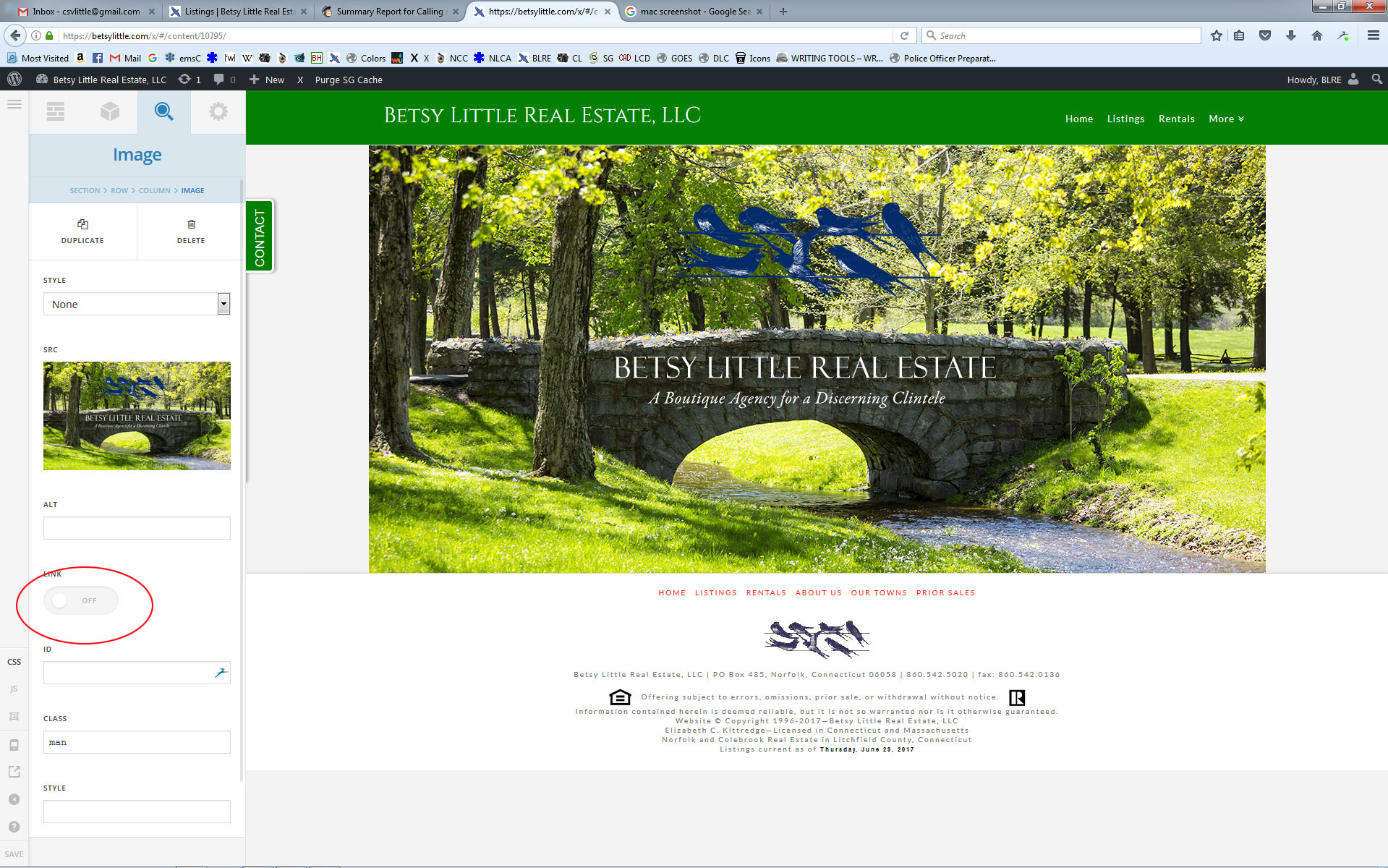
Here it is with the link on.
Hi There,
Please try with this CSS instead:
.page-id-10795 .x-img>img,
.page-id-10795 .x-img {
    width: 100%;
}
The custom CSS will change the global images so I limit them with the page ID.
Regards!
Works perfectly. Thx, Christopher
We’re delighted to assist you with this.
Cheers!
This topic was automatically closed 10 days after the last reply. New replies are no longer allowed.