Hi @askemerci,
Thanks for reaching out.
Instead of implementing the code from that thread, please add this CSS to Theme Options > CSS .
    .single-post .entry-featured, .single-post .entry-featured img {
        width: 100vw;
        position: relative;
    }

    @media (min-width: 1200px) {
     .single-post .entry-featured {
         left: calc( 0vw - ( 50vw - ( 1200px / 2 ) ));
     }
    }

    @media (max-width: 1199px) {
     .single-post .entry-featured {
         left: calc( 0vw - ( 50vw - ( 88% / 2 ) ));
     }
    }
Then make sure to change the 1200px and 88% with the value you have set in Theme Options > Layout and Design
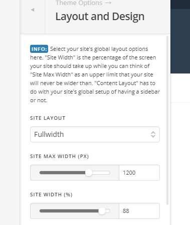
Example, if it’s changed to 1024px and 90%.
    .single-post .entry-featured, .single-post .entry-featured img {
        width: 100vw;
        position: relative;
    }

    @media (min-width: 1024px) {
     .single-post .entry-featured {
         left: calc( 0vw - ( 50vw - ( 1024px / 2 ) ));
     }
    }

    @media (max-width: 1023px) {
     .single-post .entry-featured {
         left: calc( 0vw - ( 50vw - ( 90% / 2 ) ));
     }
    }
Thanks!
