Full Width Section with Background Image + Center Aligning Footer Content

I can’t seem to get my section to be full width (for a full width hero image and top border). I tried to remove spacing from the section and setting the width to 100% but it still isn’t full width.

I’m also trying to center align the footer content (with the social media icons and footer nav) but cannot seem to figure it out.

Hi Dush,

Coming Soon and Maintenance page is ON on your site. I cannot see the issue.

As a guest, are you using a NO CONTAINER page template? If not, your page width is subject to container which the width is based on THEME OPTIONS > LAYOUT and DESIGN : SITEWIDTH and SITE MAX WIDTH settings. Try to use a NO CONTAINER template instead.

By default, on all stacks, Footer content and are center aligned. We might need to access your site to see the issue directly. Please share credentials inside a secure note

Hey @Dush,

Please refer to the screenshot below and answer the next question.

Is that the hero image you’re referring to? It already spans fullwidth. If that is not the hero image you’re referring, please give us with a screenshot.

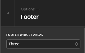
Regarding your footer, go to X > Theme Options > Footer and select 3 Footer Widget Areas.

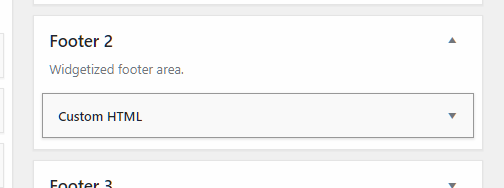
Next, go to Appearance > Widgets and move your widgets to Footer 2. Footer 2 is the center column in a 3 column footer setup.

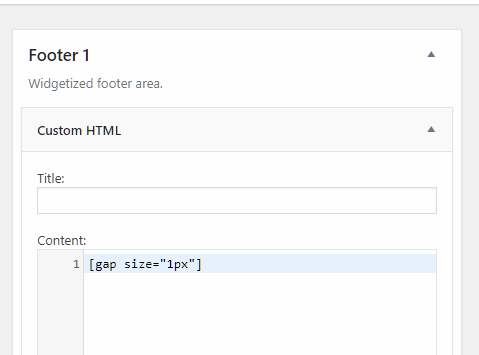
After that, insert a Custom HTML element in Footer 1 and in that widget, insert a Gap element with 1px size.

[gap size="1px"]

If you’ll be using the Ethos stack, doing the Gap method will output a border line on top of it so an alternative to that would be to add this code in Theme Options > CSS

.x-colophon .x-column {
    min-height: 1px;
}

Hope that helps.

I figured out the full width images, thanks. (Though it would be awesome if there were an easier way to do this, as it’s such a common feature).

The footer is in the middle now but the section isn’t wide enough for the content - how can I widen just the middle column of the footer?

Hello @Dush,

Because you are using a three column footer set up, each of the columns has a 33% width of the container. If you need to increase the column width of the middle column, please add the following CSS code in the X > Theme Options > Global CSS (http://prntscr.com/evui3r)

.x-colophon.top .x-column.x-md.x-1-3:nth-child(1),
.x-colophon.top .x-column.x-md.x-1-3:nth-child(3){
    width: 10%;
    margin-right: 0;
}

We would love to know if this has worked for you. Thank you.

Unfortunately this did not work. How else can I do this?

Hello @Dush,

It turns out that you also enclosed your custom html codes with rows and columns. I went ahead and resolved your issue. I added this custom css:

.x-colophon.top .x-column.x-md.x-1-3:nth-child(1),
.x-colophon.top .x-column.x-md.x-1-3:nth-child(3) {
    width: 10%;
    margin-right: 0;
}

.x-colophon.top .x-column.x-md.x-1-3:nth-child(2){
  margin-right: 0;
  width: 80%;
}

.x-colophon.top .x-column .widget .row {
    text-align: center;
    width: auto;
    display: inline-block;
}

Please check your site now.

The column widths look great now but the content still isn’t centered. Any ideas?

Hello @Dush,

I have made the necessary changes and it is centered now.

I updated this code:

.x-colophon .widget {
    margin-bottom: 1.5em;
   margin-top: 2em;
   text-align: center;
}

Check your site now.

Perfect, looks great! Thanks so much.

You’re welcome, Dush.

This topic was automatically closed 10 days after the last reply. New replies are no longer allowed.