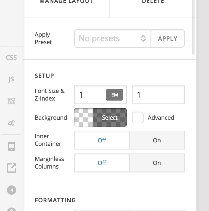
Full width section image

Hi Guys,

I have a site set at full width with with a 93% content areas with this CSS:

body .x-main {
max-width: 93%;
margin: 0 auto;
}

The page is: http://testing.johnrooneydesign.com/wp/about-us/

Is it possible to have one section in full width like the attached image? If so, would I add an ID to the section and use CSS?
Hi There,

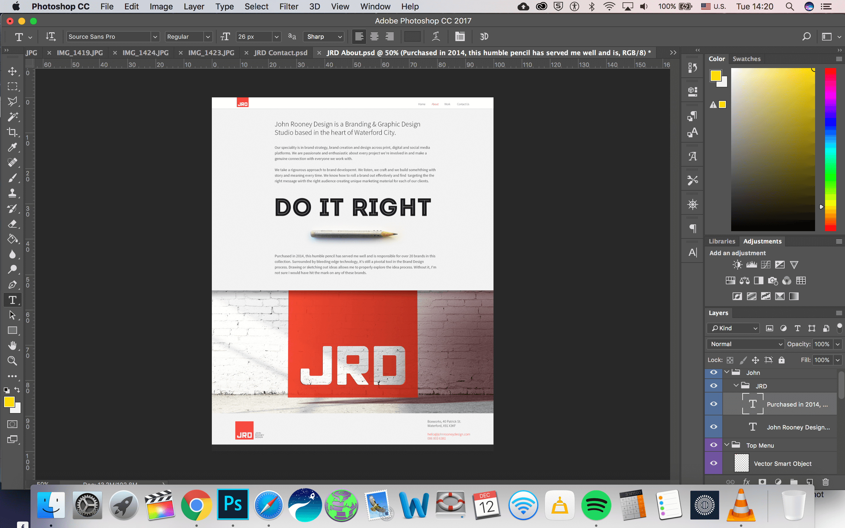
Thanks for writing in! To make the section full-width, you have to disable the Inner Container of the row in the section (see screenshot).

Hope that helps.

Hi,

Thank you for that, but I’m looking to have the image to go the full width of the screen, like in a section background image would without any container. So basically I’m looking to bypass the 93% content area that I have established with Custom CSS, and have it 100% for this one section. Is that possible?

Hi there,

That is possible but that would involve further customization which goes beyond the scope of our support.

If you disable the Inner Container of the section that contains the image, it will fill the entire width of it’s container. The blank template should let you use the entire with of the screen when you disable the Inner Container but since you have added your custom CSS to set the page container’s width to 93%, you will need to find some other alternative to achieve your goal.

What I can suggest is that instead of setting the entire container to 93%, you might want to create a class that would set the width of every section to 93% and add that class name to each section that you want to be limited to 93% in width.

Hope this helps.

Hey,

That’s a really smart suggestion and a sensible work around.

And just to not only expose my own ignorance, but to milk your own knowledge, If I was to call the class ‘contain’, what would the CSS be for that, and would I replace the CSS I have already (below) or just amend it?

body .x-main {
max-width: 93%;
margin: 0 auto;
}

Hi There,

That would be:

body .x-main .x-container.width {
	max-width: 93%;
}

The thing is, you don’t need that Custom CSS because the Theme provided you the Site Width option under Theme Options > Layout and Design which does the same thing.

Then like Darshana instructed above, turn off the ROW’s Inner Container on the section that you want to go fullwidth.

Hope it helps,
Cheers!

Hi,

I appreciate the advice, but this is my quandary:

The homepage is exactly how I like it, it’s full width and the max width means that I control the gridded structure on the homepage (http://testing.johnrooneydesign.com/wp/).
Everything else is working just fine at the moment, except this on section image that I want to bypass the 93% restriction and go full width. I

So, if I go with Jade’s suggestion that I create a class, call it ‘contain’, and have all the sections that I want to contain obey that CSS instruction, and just don’t put a class for the sections I want to go 100%.

What would be the CSS code for that to work? Again, thank you.

Hi There,

The best way to achieve that is to go to Cornerstone | Settings | Templates select: Blank No Container Header Footer.

On all rows, you will leave the Column Container ON to expect on the Row where you want your background image to reach the edges.

To find those settings click on the maginifying lens of your ROW

If the rows are still too large even with the column container on, you can add a bit of margin left and right to adjust it. I recommend using % instead of px in order to get better responsiveness.

Hope it heps

Hi Joao,

I appreciate your help, but the CSS code limiting the content area to 93% stops the section or row going the full width of the screen, which is what I’m after.

Is there a way to use the below CSS, and it only have it be applied to specific pages, i.e., the Home Page?

body .x-main .x-container.width {
max-width: 93%;
}

Hi There,

Yes, you can update that CSS to:

body.home .x-main .x-container.width {
max-width: 93%;
}

That would be:

.contain .x-container {
	    width: 100% !important;
}

The thing is, you can not really have a fullwidth section (edge to edge), because you have a code that limit the main container to 93%

body .x-main {
    max-width: 93%;
    margin: 0 auto;
}

Hope this shed some lights,
Cheers!

Hi Guys,

Again, I really appreciate your help here, and I feel like we’re tantalisingly close to a solution.

Is there any way of having this code :

.contain .x-container {
width: 100% !important;
}

override the 93% container of this:

body.home .x-main .x-container.width {
max-width: 93%;
}

Or just have the body.home CSS only apply to the home page, and leave the ‘about’ page to obey the 100% site width of the site when set to fullwidth and have no container in the row?

Hi there,
You can simply change the code to apply only on the homepage by adding the body.home to the beginning of the code:

body.home .contain .x-container {
width: 100% !important;
}

Please kindly consider that this is getting deeper and deeper into the realm of the customization and implementation of changes which is not the built-in functionality of the theme. Unfortunately, we can not assist further and you need to continue this on your own or consider asking for paid developers in the X Facebook User Group.

I’m sure you will understand that we did our best to help and give you the starter codes which then you can build upon.

Thank you.

Yeh no problem, listen thanks for all your help guys.

Glad to hear that :slight_smile:

This topic was automatically closed 10 days after the last reply. New replies are no longer allowed.