Full-width image

I’m sure this gets asked a lot but I can’t find a satisfactory answer.

On www.followtheboat.com the first image is full-width. However, I have a 4K screen so in order to make it full width I’ve had to upload an image over 3000px wide. As you can imagine this is a big image.

How do I replace it with one that is, say, 1000px wide, and keep it 100% width, whatever the screen?

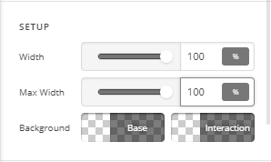
I have tried creating a new section where the row has inner container turned off, width and max width set at 100%, marginless column off. I’ve uploaded an image that’s 700px wide with width and max width set to 100%, but it only ever displays at 700px wide.

I’m sure this is really easy to solve, I’m just have a dumb moment.
Hi @demonboy,

Thanks for reaching out.

You can simply upload the 1000px image to replace the existing 3000px. But, if the main question is just making it full-width regardless of image size then please follow this,

  1. Please edit your page and change its page template to a Blank - No Container template.
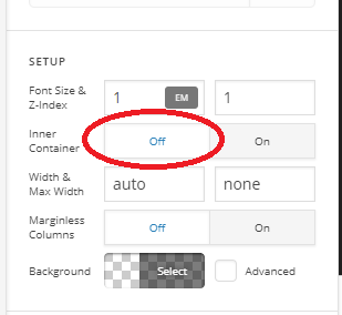
  2. Inspect each rows of your section and turn off the inner container (where the image is)

  1. Inspect your image and make sure its max-width and width are 100%

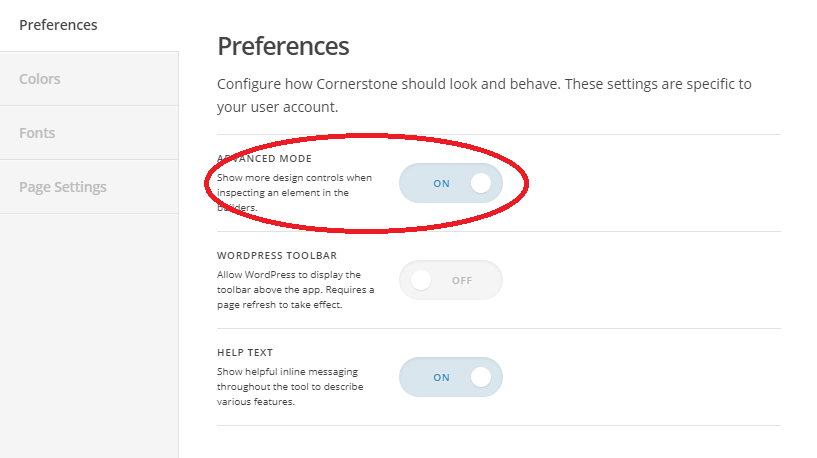
And if you can’t find this option then maybe the Advanced Mode is turned off. Please click the Cog (gear) icon in the builder’s left panel and go to Preferences section and toggle on the Advanced Mode. Then continue the above recommendation.

Both page template layout and section rows have containers which you need to turn off in order to achieve the absolute full-width layout.

Thanks!

Hi Rad,

Thanks for the reply but all you’ve done is replicate what I’d explained in my OP.

Hi there,

I checked the first image of the homepage and it is 2000x1123 so the maximum width the image will fill will be 2000px.

Here are some options you have:

You may use an image that is large enough to fill a 4k screen. 4k screens are usually 3840px in width.

You may add this CSS code to Element CSS of the image element which will force the image to stretch to the screen’s 100% width.

$el img {
    width: 100%;
}

The downside to this approach is, since we are forcing the image to fill 100% of the width which is more than the actual image width, the image will look stretch and unclear.

Hope this helps.

1 Like

This topic was automatically closed 10 days after the last reply. New replies are no longer allowed.