Hey @ronei1682,
There is no cover option for the Image element nor the image in the Image Element can be set to 100%. The reason for this is you will need to use a quality image for the display/monitor you intend to support. For example, if your monitor resolution is 1920 x 1080px, you should use an image with a minimum resolution of 1920px. If you’re going to support Retina devices, you need double than that. If you use lower than that, the image element will display the native resolution of the image even if you set the Image Width option to 100%. Take a look at the screenshot below for a visual example.
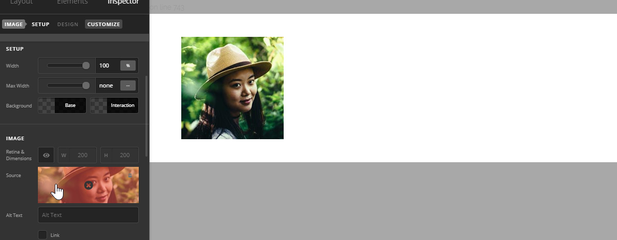
Through custom CSS, that image can be set to 100% but that would look blurry in large screens. This is true if you’re using an image as a Section background. Try using a 200px image to see what I mean. Though it will span fullwidth or 100% or cover the screen, it would look blurry.
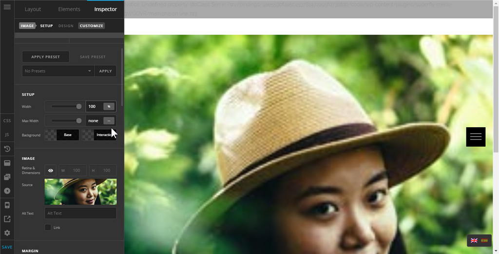
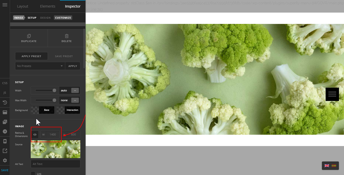
Below, I’m using an image that is larger than my monitor’s resolution. It will span fullwidth out of the box provided that I don’t enable the Retina support option. If I’m going to support Retina screens, the image must be double than that.
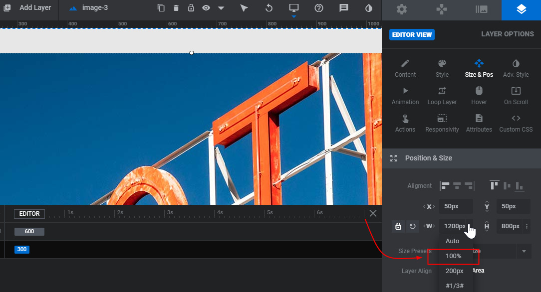
Slider Revolution’s Image layer can be set to 100% but again, you need to take into account the pixelation (blur).
Hope that helps.


