Full Screen Revolution Slider on Mobile Landscape

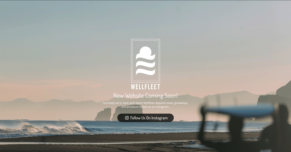
I’m trying to create landing page which takes up the full screen with a background image. I’ve done this using fullscreen Revolution Slider on my page with all the info/logo in the middle of the page.

It looks great on desktop (see below)
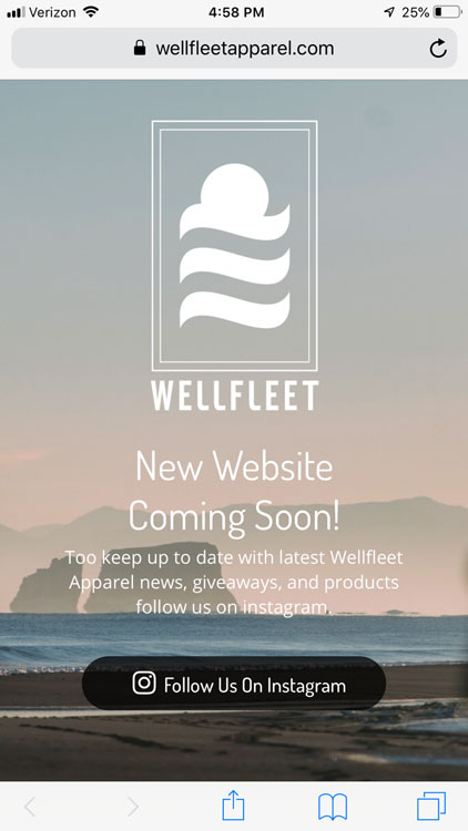
And great on mobile portrait
But as soon as I flip it around to mobile landscape, its messed up.
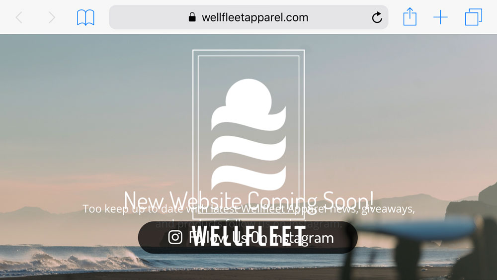
I can’t find any settings in Revolution Slider for optimizing mobile on landscape mode. I’m willing to design this entirely in Cornerstone, but I didn’t see an option to make a full screen page with content in the middle.

Hi,

Please note that you can rearrange your layers and adjust font size based on screen width.

  1. Screen/Device

To use this option, you first have to enable a Custom Grid Size for additional screens/devices.

Toggling between the different options here will allow you to style and position your Layer content based on the selected screen/device.

For example, if you had a text-based layer, you could assign it a font-size of 64px, with a top-right position for desktop view. Then if you switch to the smartphone view, you could change the layer’s font-size to 32px, and give it a bottom-left position.

For mroe information kindly refer to the link below

https://www.themepunch.com/revslider-doc/slide-layers/#layercanvas

Hope that helps

1 Like

This topic was automatically closed 10 days after the last reply. New replies are no longer allowed.