Hey Marcel,
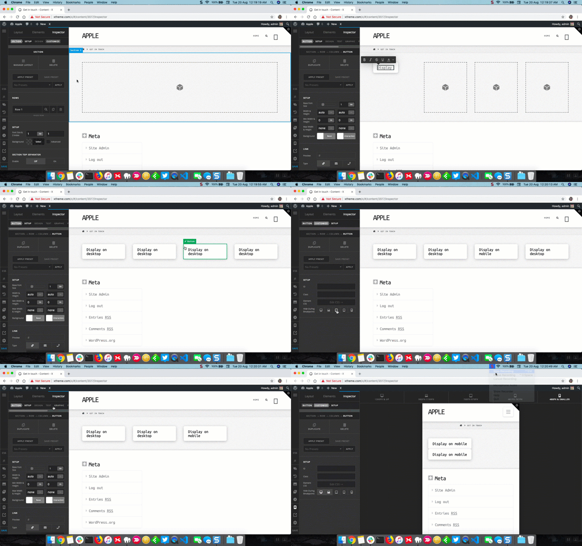
I see you’ve already given a class stay-inline to the section that has four columns. Now to display two column layout on mobile devices, please add the following code in the Theme Options > CSS:
@media screen and (max-width: 767px) {
    .stay-inline .x-column {
        width: 48%;
        margin-right: 4%;
        float: left;
    }
    .stay-inline .x-column:nth-child(2n) {
        margin-right: 0
    }
    .stay-inline > .x-container {
        width: auto;
    }
}
Here are some related links for further reading, this could help you in finding and implementing some CSS fixes:
Don’t forget to clear all caches including your browser’s cache after adding the code. Let us know how this goes!

