Hello, I’m hoping you can help us with our website http://www.titannutrition.net/
If you view the menu on the web it views fine, however on mobile each menu dropdown is extended and the links don’t seem to work.
Any suggestions is appreciated.
Hello, I’m hoping you can help us with our website http://www.titannutrition.net/
If you view the menu on the web it views fine, however on mobile each menu dropdown is extended and the links don’t seem to work.
Any suggestions is appreciated.
Hi @drrule,
Thanks for writing in.
I have checked your site both mobile and desktop. I could see that it is working well.
Would you mind sharing us more details on what device are you using and screencast or screenshots so we could replicate it in our side.
Thanks.
Thanks Nico,
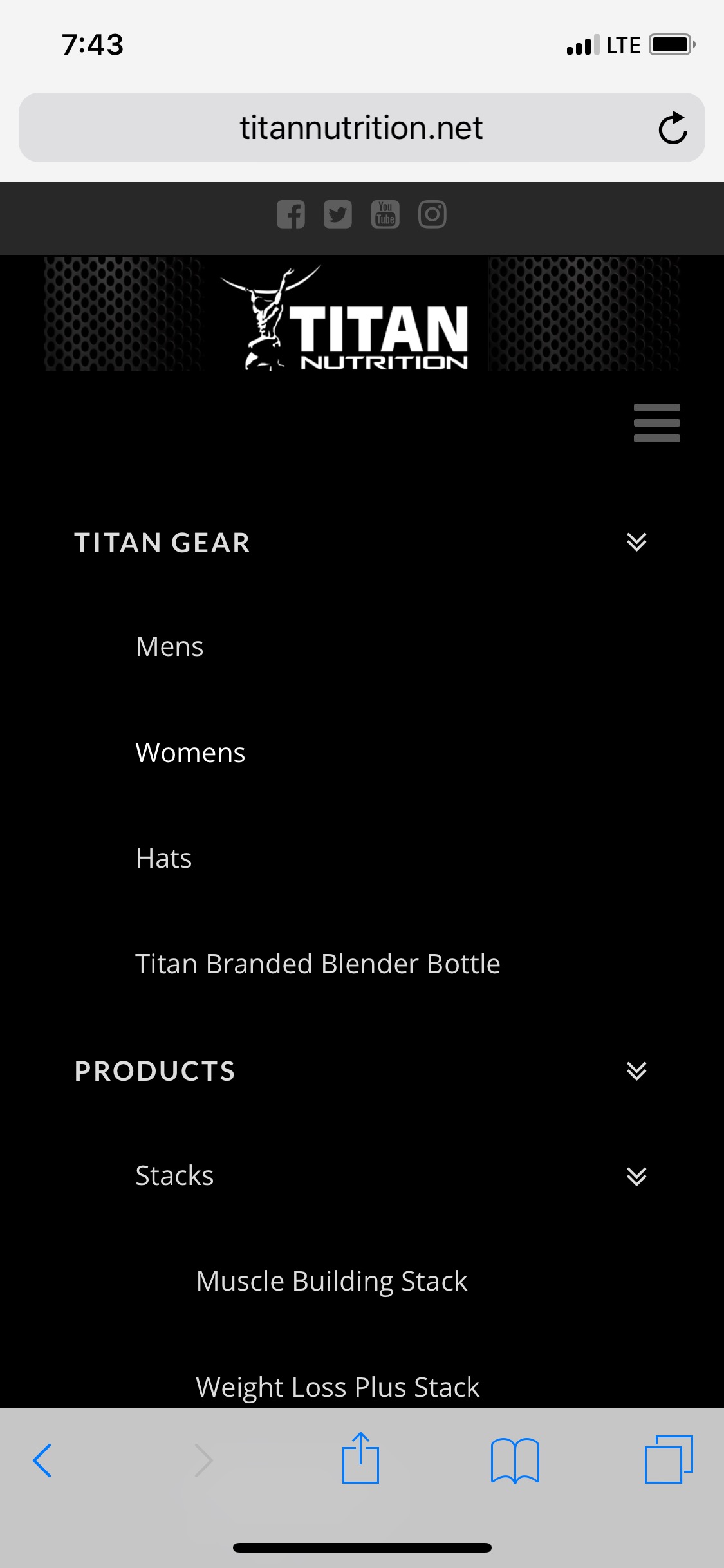
The menu won’t collapse on IOS, see image.
Hi there,
The mobile icon issue seems to be caused by the site’s cache. If you have an optimization plugin, kindly try to clear the cache fully.
Also, by default, the main link with submenu is not clickable and will just reveal those submenus when click. We have plans on making just the sub indicator to open the submenu and make the main link clickable but we don’t have an ETA for this yet.
For the meantime, kindly add this code in the X > Theme Options > JS as a workaround for that issue:
jQuery(document).ready(function($){
	$('.x-navbar .mobile .x-nav li > a').on('touchend click', function(e) {
		var link = $(this).parents('.x-anchor-menu-item').attr('href');
		window.location.href = link;
	});
});
This topic was automatically closed 10 days after the last reply. New replies are no longer allowed.