I am trying to customize (https://gurumdsitedev.vertex.com/)my menu in mobile version for the log to move on top as the menu bar below it. This would be an example of what I’m looking to do: 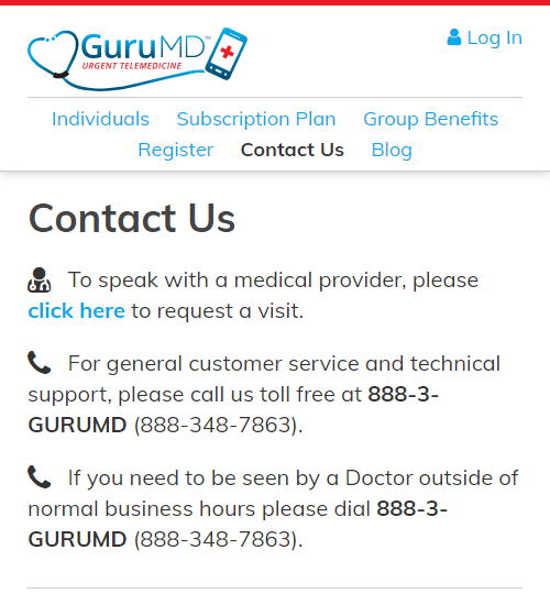
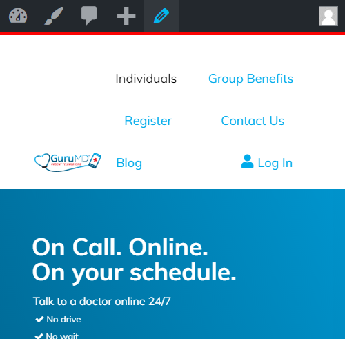
But does is what current site looks like:
I am trying to customize (https://gurumdsitedev.vertex.com/)my menu in mobile version for the log to move on top as the menu bar below it. This would be an example of what I’m looking to do:
But does is what current site looks like:
Hello mark,
Thanks for writing in!
I have checked your site and I can see that you are using Pro theme. Please be advised that the Navigation Inline element is best to use in desktop screens. This applies to both the header and footer. For smaller screens, please use the navigation dropdown, navigation collapsed or navigation layered element instead.
Hope this helps.
Well the client doesn’t want to use those options. Wants the nav to appear like it does in desktop which is inline. So what I did is copy the main header bar and I am hiding the bar to only show on mobile. It looks like this: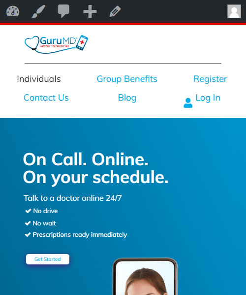
What I need now is how to get the Log in menu item to appear next to logo in the top right had corner and also how to bring the menu nav items closer together.
Hi Mark,
Those spaces can be adjusted using Navigation Element padding and margin settings. See this: https://screencast-o-matic.com/watch/cYVefJvTrc
If current padding and margins is suited for desktop, it would be best to duplicate that element. So you will have to nav inline element. The first is visible on desktop, the other is on mobile using HIDE DURING BREAKPOINTS under Customize tab. This way, you can easily adjust padding and margins on nav inline for mobile without affecting how it looks on desktop.
Hope this helps.
Hope this helps.
This topic was automatically closed 10 days after the last reply. New replies are no longer allowed.