Hi there,
Is there a way to force a responsive 2-column grid layout where one column is an image that always fills the column area regardless of viewport size?
Something along the lines of this:
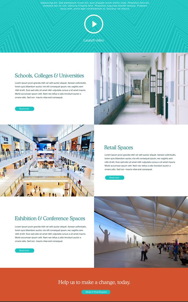
When I resize the browser window the image doesn’t fill the column area. If I turn-off the image retina setting and force image width size to 100% it seems to work, but then I need to add a few gap elements of different sizes and different viewport visibilities to keep the text centered in the column. I was wondering if there is a more elegant solution?
Thanks in advance.