I’m working on a new site here for now: http://www.atlantis.choiceadaptive.com/
When the window is narrower the footer disappears. I’m using Pro. How do I keep the footer on mobile width layouts too?
I’m working on a new site here for now: http://www.atlantis.choiceadaptive.com/
When the window is narrower the footer disappears. I’m using Pro. How do I keep the footer on mobile width layouts too?
Hi @kvpadmin,
Thanks for writing in.
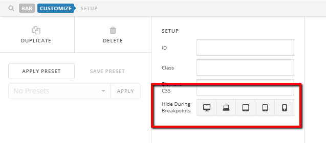
I could see that you have set your footer hidden when the screen size is small.

To enable footor in smaller screensize, go to your footer builder. then edit your footer.
Then enable again your footer for breakpoints.
Hope it helps.
Thanks.
This topic was automatically closed 10 days after the last reply. New replies are no longer allowed.