Hi! I built a website – http://www.hockeydepartment.de – with Pro. My problem is that the footer dissapears when the screensize shrinks. Thx for your help!
Hi There,
Thanks for writing in!
Please edit the footer in footer builder and edit the bar container. Then go to customize section.
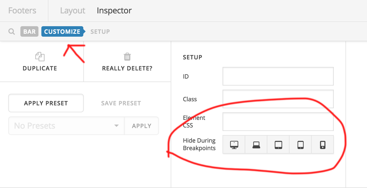
Diselect all device icon in the list. THen save it.
Hope this helps!
Thanks
Hi!!! Thank you so much for the respond. Works. 
On behalf of my colleague, you’re welcome. Cheers!
Btw, when i want to use an alternative footer for mobile devices, is it possible? Or can i only make one „global“?
Hi there,
The Hide During Breakpoints is available in elements, container, and even header bar. You don’t have to create separate custom header for each device, you can simply create header bars for each device on the same custom header. Or just the elements itself. Example, you can hide inline menu element from mobile, then hide navigation collapse from desktop.
Thanks!
you are genious ;), thx
You are most welcome!
This topic was automatically closed 10 days after the last reply. New replies are no longer allowed.