Hey there,
I love the header and footer builder!
I created a container for my XL LG and MD screens and now trying to create one for SM and XS screens specifically,
however when I view the builder in XS screen view, it shows all the footer containers including the ones that are supposed to be hidden at SM and XS screen sizes. Resulting in everything overlapping and impossible to work on the mobile footer properly.
I uploaded a screenshot for reference.
Thank you for helping me!
Emile
p.s. URL and Login access in next message.
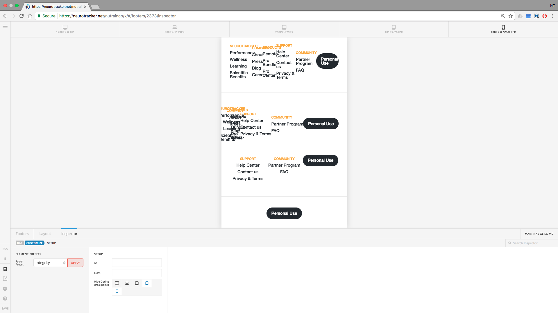
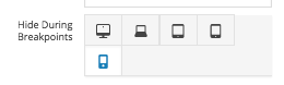
It’s like if the “Hide During Breakpoints” option is being ignored for some reason.
Hello There,
Thanks for writing in! I noticed that you are using CloudFlare. Could you please apply the suggested CloudFlare settings from this link:
https://xthemetips.com/using-cloudflare-rocket-loader-with-x-pro-and-x5/928/
Please let us know how it goes.
Hello,
Thanks for your reply! I applied the suggested CloudFlare settings and everything worked well for the past month. Now it started to break the layout on an iPhone again. Do you have a fix for this?
Thanks!
Hello There,
Please enabled the development mode in CloudFlare. If you have installed a caching plugin, please clear your plugin cache. Back in CloudFlare, please purger everything and test your site again.
And by the way, in your iPhone, please clear the browser cache or use private browsing mode before your test your site.
Please let us know how it goes.