Footer Builder flexbox: How to SIMPLY switch from ROW to COLUMN layout

Hi Support

Please could you help with flexbox into Footer Bulder ?!?!

Please could you suggest me best practice in order to SIMPLY switch from ROW to COLUMN layout (like following image)
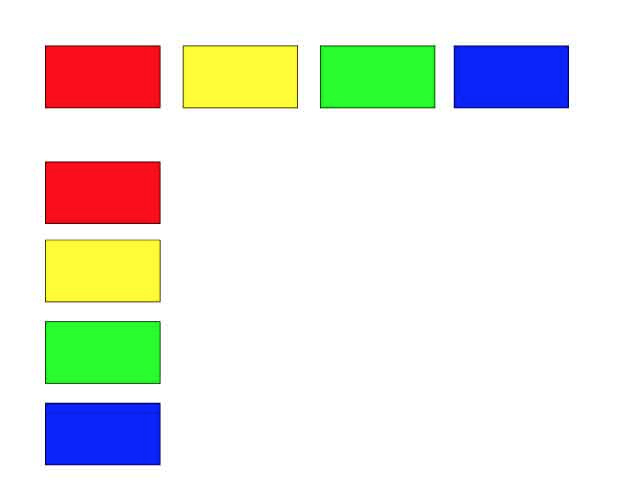
SIMPLY I’d like:

  • ROW layout on Desktop
  • COLUMN layout on Mobile

This is very simple with X footer, with column shortcode or block_grid shortcode…
But it seems very difficult (for me) with Footer Builder flexbox system

Please could you suggest me an easy way, without duplicate Bars (and hide them respectively on Desktop or Mobile)?

Thank You

doing this requires a bit of css, but i’ll try to give you the “copy-paste solution”.

so first of all, make sure you have the desired DESKTOP settings in place (so you have you containers and/or bars with the “row” settings.

then just add class of your liking to the desired(s) cointainer(s) (i’ll use this one: .column-layout), it should look like this: http://prntscr.com/h91bm1

then click “css” on the footer’s bar options and paste this code:

/* COLUMN LAYOUT ON MOBILE */

@media(max-width: 480px){
   .column-layout{
      flex-direction: column !important;
   }
}

change “480px” to your desired width (in this case, you’ll only see a column-layout on mobiles with small screens, you can change this to 768px for bigger screen sizes or to whatever you like, it’s up to you :wink: )

PS: è sempre bello poter aiutare un collega :slight_smile:

Thank You Alejandro

P.S. Italiano anche tu?

you’re welcome :wink:

P.S: non sono italiano (ancora) ma ci abito da un beeeeeeeeeeeeeeeeeeel po, hehe.

@elpanda13

Thanks for helping out. Cheers! :slight_smile:

This topic was automatically closed 10 days after the last reply. New replies are no longer allowed.