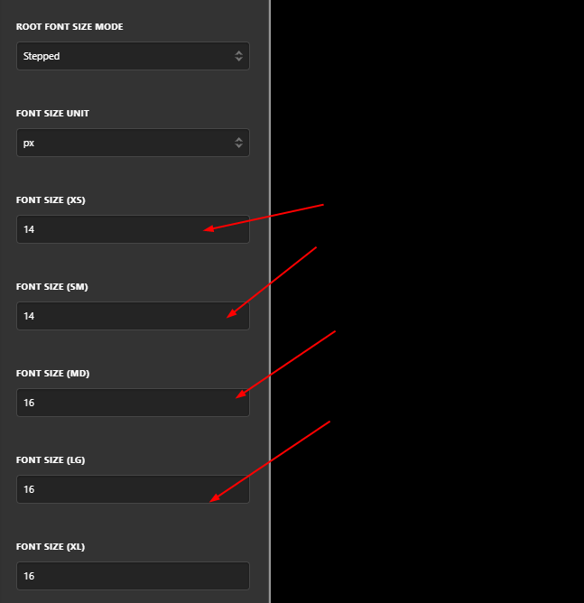
I’ve looked at a number of similar posts, and tried to add in custom css code to make the font size bigger when viewed on mobile. But with little success.
Here is the recent css code just added:
.entry-header, .entry-content {
font-size: 28px;
}
@media(max-width: 767px) {
.entry-header, .entry-content {
font-size: 14px;
Can you please advise on how I can modify the code to make the text size bigger on smaller devices like mobile.