Hello. I’m trying to add a float to where every thumbnail, no matter which orientation, will completely fill the parent container, and will just crop accordingly to not allow any white space around the picture. Essentially, the picture will take up the left X% of the screen, from top to bottom, and the .entry-content will fill the remainder, Think of it like a 1/5 + 4/5 content row, where the image takes up the left. Let me know if I need to be clearer. Thanks in advance!
Hi @jrhager84,
Thanks for reaching out.
You mean there should be no cropping on the featured image? Then you have to change this custom CSS
.blog .entry-featured img {
    width: auto;
    max-height: 300px;
    object-fit: none;
}
to this
.blog .entry-featured a {
    width: 200px;
    object-fit: none;
}
Hope this helps 
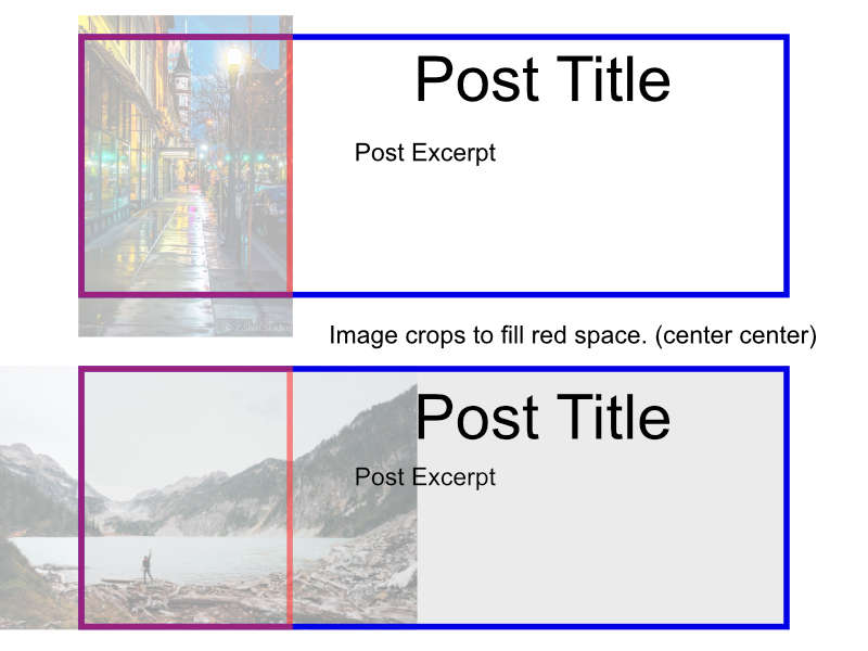
I don’t mind cropping, because there are portrait photos and landscape photos. Think of it like this:
Hello @jrhager84,
Do you want something like this instead?
If that is the case, you will need to remove the previous code you’ve added and update to this code instead:
@media(min-width: 980px){
	.blog .entry-featured {
	    float: left;
	    padding-right: 20px;
	    box-shadow: none;
	    border: none;
	    width: 33%;
	}

	.blog .entry-wrap {
	    float: left;
	    width: 65%;
	}

	.blog .entry-footer {
	    padding-top: 2em;
	    display: block;
	    clear: both;
	}

	.blog .entry-featured,
	.blog .entry-wrap {
	    min-height: 350px;
	}

	.blog .entry-featured{
	    max-height: 350px;
	}

	.blog .entry-featured img {
	    width: auto !important;
	    min-height: 310px;
	    max-height: 310px;
	}

	.blog .entry-thumb{
	    padding: 20px;
	    background-color: white;
	}
}
We would loved to know if this has work for you. Thank you.
I’d rather the picture rested inside the content box, or at the very least butts up against it. So there’s picture | Post where they’re always the same height.
Hello @jrhager84,
Do prefer the featured image inside the excerpt wrapper like this?
In that case, please remove the previous code entirely. And then do the following:
1] Using Notepad or TextEdit or Sublime Text or any text editor, please create a new file in your local machine.
2] Insert the following code into that new file
<?php

// =============================================================================
// VIEWS/INTEGRITY/CONTENT.PHP
// -----------------------------------------------------------------------------
// Standard post output for Integrity.
// =============================================================================

?>

<article id="post-<?php the_ID(); ?>" <?php post_class(); ?>>

  <div class="entry-wrap">

  	<div class="entry-featured left mbm">
    	<?php x_featured_image(); ?>
	</div>

    <?php x_get_view( 'integrity', '_content', 'post-header' ); ?>

    <?php x_get_view( 'global', '_content' ); ?>

  </div>

  <?php x_get_view( 'integrity', '_content', 'post-footer' ); ?>

</article>
3] Save the file named as content.php
4] Upload this file to your server in the child theme’s folder wp-content/themes/pro-child/framework/views/integrity/. You will have to create the folder path since it does not exist in your child theme yet.
5] And then you will have to add this custom css:
@media(min-width:980px){
    .blog .entry-featured,
    .archive .entry-featured{
        margin-bottom: 0 !important;
        padding-right:20px;
        box-shadow:none;
        border:none;
        max-width: 300px;
    }

    .blog .entry-footer,
    .archive .entry-footer{
        padding-top:2em;
        display:block;
        clear:both;
    }

    .blog .entry-featured,
    .archive .entry-featured{
        max-height:350px;
    }

    .blog .entry-featured img,
    .archive .entry-featured img{
        width:auto !important;
        min-height:351px;
        max-height:351px;
        object-fit:cover;
    }

    .blog .entry-thumb,
    .archive .entry-thumb{
        background-color:white;
    }
}
In this solution, the blog index and the archives pages will have the layout as shown in the screenshot above.
We would loved to know if this has work for you. Thank you.
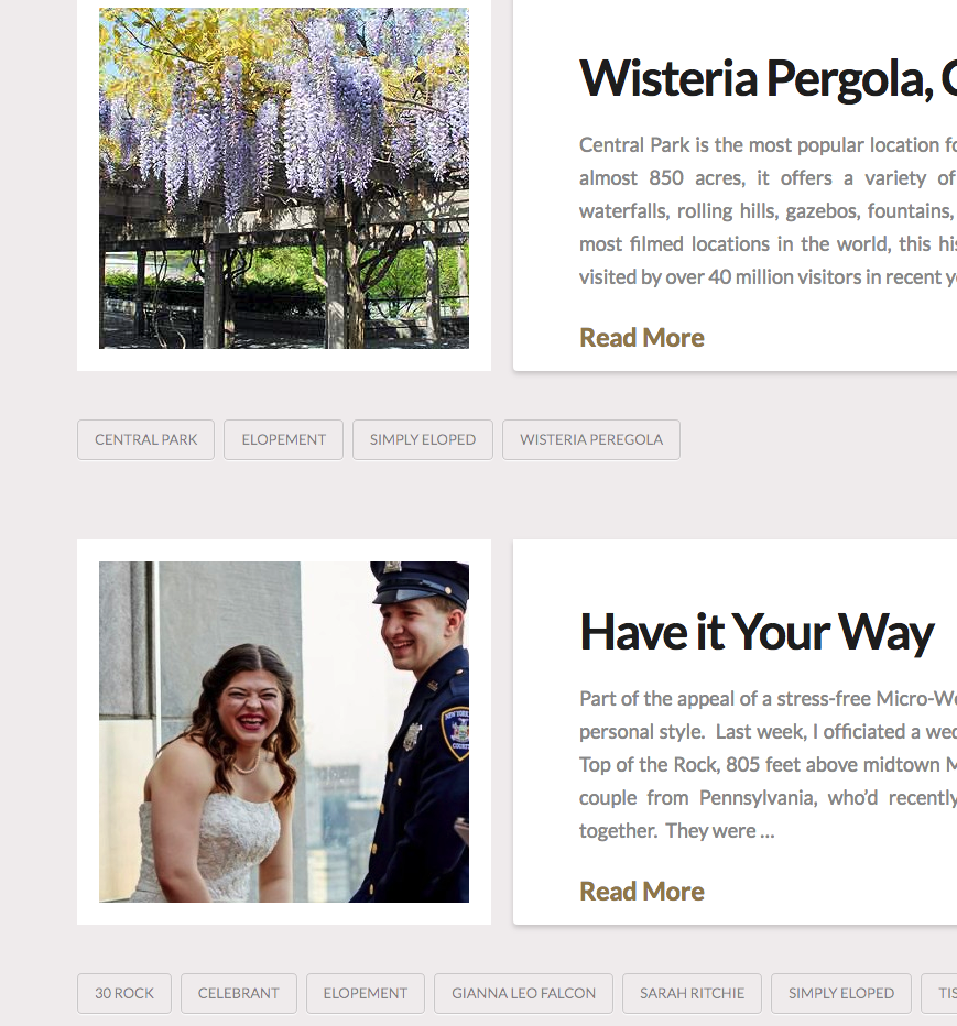
Well, more importantly, I want it next to the content (i.e. no padding) and full-height. See my example for reference. Basically what was provided first is 90% of what I need, but I can’t seem to remove the padding between the containers, and I don’t want the white padding on the image if I can avoid it.
Hello @jrhager84,
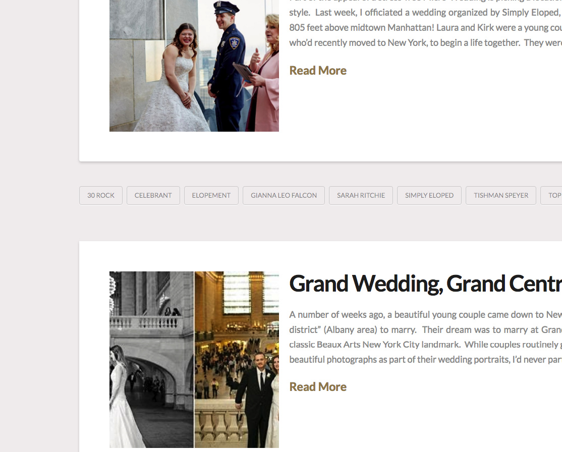
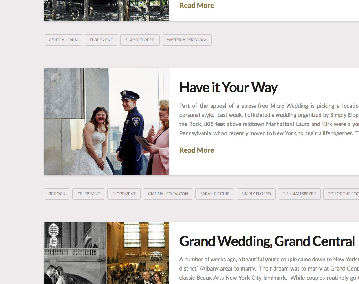
Do you mean like this?
I am using this code:
.blog .x-main .hentry.has-post-thumbnail>.entry-wrap,
.search .x-main .hentry.has-post-thumbnail>.entry-wrap,
.archive .x-main .hentry.has-post-thumbnail>.entry-wrap {
    float: right;
    width: 66%;
    padding-left: 35px;
    border-radius: 0;
}

.blog .x-main .hentry>.entry-featured,
.search .x-main .hentry>.entry-featured,
.archive .x-main .hentry>.entry-featured {
    float: left;
    width: 34%;
    margin: 0;
    box-shadow: 0 0.15em 0.35em 0 rgba(0,0,0,0.135);

}

.blog .x-main .hentry.has-post-thumbnail>.entry-wrap,
.search .x-main .hentry.has-post-thumbnail>.entry-wrap,
.archive .x-main .hentry.has-post-thumbnail>.entry-wrap,
.blog .x-main .hentry>.entry-featured,
.search .x-main .hentry>.entry-featured,
.archive .x-main .hentry>.entry-featured{
    min-height: 350px;
    max-height: 350px;
    overflow: hidden;
}

.blog .entry-featured img,
.search .entry-featured img,
.archive .entry-featured img {
    width: auto;
    min-height: 350px;
    max-height: 350px;
    object-fit: cover;
}
We would loved to know if this has work for you. Thank you.
That is EXACTLY what I was looking for. Thank you!
Glad that we could be of a help
This topic was automatically closed 10 days after the last reply. New replies are no longer allowed.