Hey @RPronk,
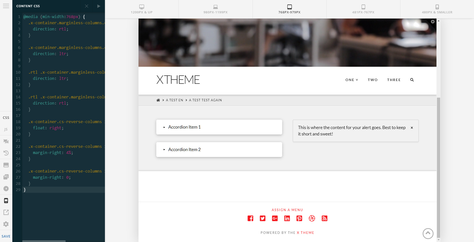
I’d recommend that you try this method. The CSS snippet that was given to us by our core developer to temporarily aid for this case is this:
@media (min-width:768px) {
  .x-container.marginless-columns.cs-reverse-columns {
    direction: rtl;
  }

  .x-container.marginless-columns.cs-reverse-columns > .x-column  {
    direction: ltr;
  }

  .rtl .x-container.marginless-columns.cs-reverse-columns {
    direction: ltr;
  }

  .rtl .x-container.marginless-columns.cs-reverse-columns > .x-column {
    direction: rtl;
  }

  .x-container.cs-reverse-columns > .x-column {
    float: right;
  }

  .x-container.cs-reverse-columns > .x-column:last-of-type {
    margin-right: 4%;
  }

  .x-container.cs-reverse-columns > .x-column:first-of-type {
    margin-right: 0;
  }
}
You can insert that in Theme Options > CSS for global application or Content CSS to apply it only on per page basis.
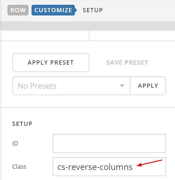
With that CSS in place, you just need to add this class: cs-reverse-columns to your row.
And, that will flip the columns in desktop to tablet view.
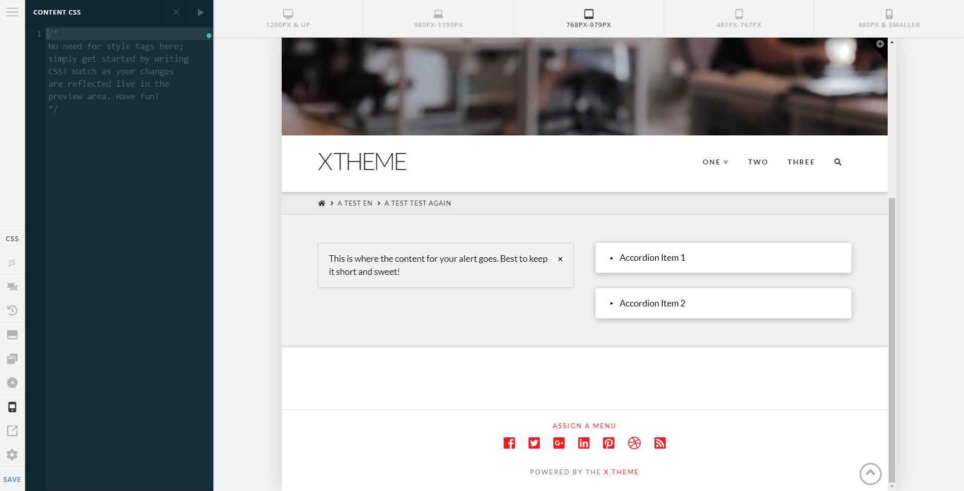
Screenshot without the CSS:
Screenshot with the CSS
In mobile view, the original setup will take effect since the CSS is wrapped in a media query. Remember that the original setup is the top column is the left column (not the flipped one)
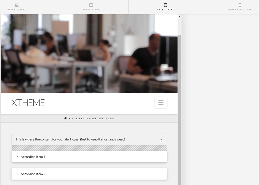
In that screenshot above, I used a Gap element that only displays in mobile or acts as a responsive spacer using the Hide During Breakpoints feature.
I also said this is temporary because in the future, there might be a way to achieve this easily or without custom CSS.
Hope that helps.


