Fixed Mobile Menu Hiding Section Titles of Page Sections that it jumps to

Hi All,

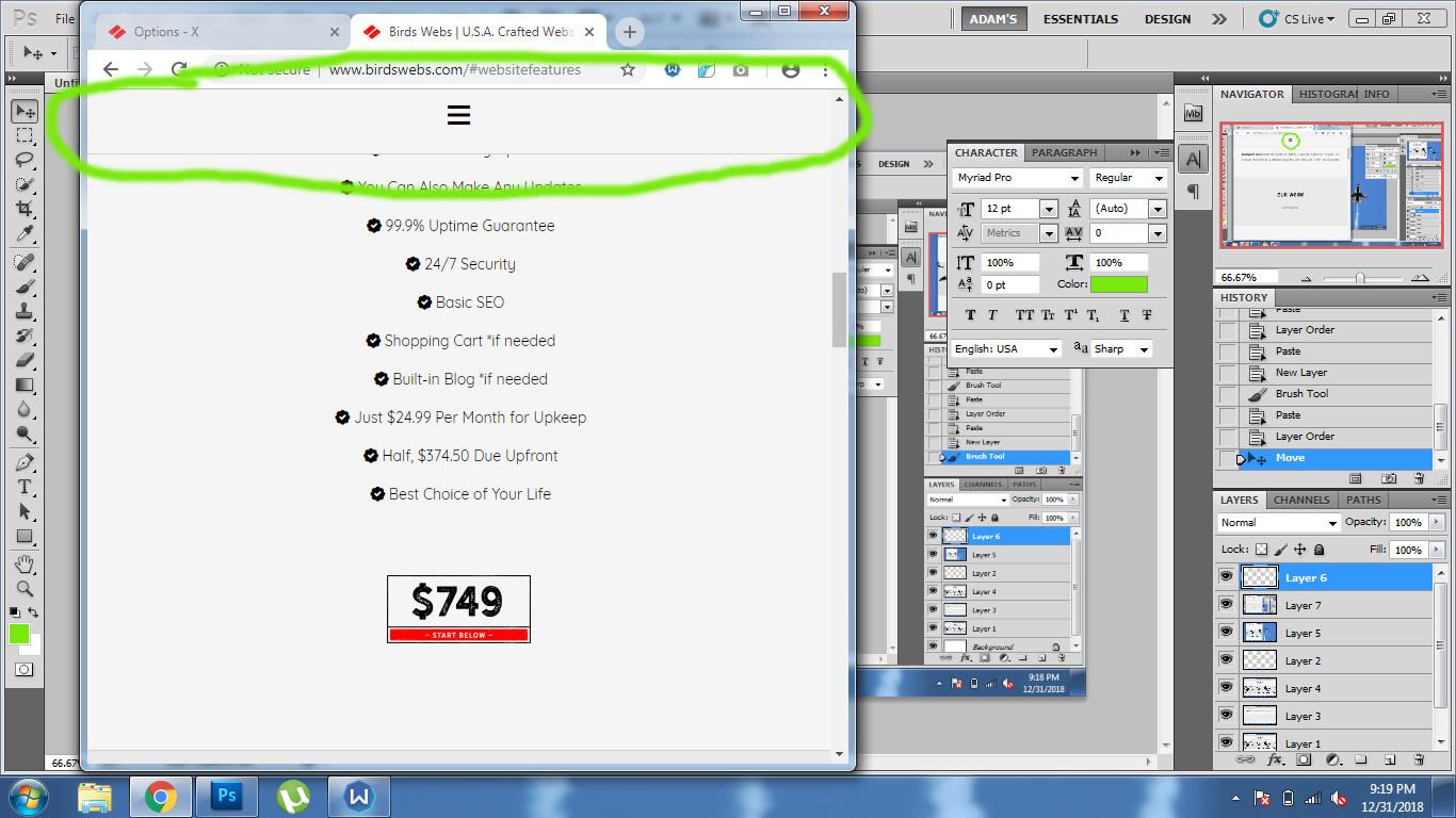
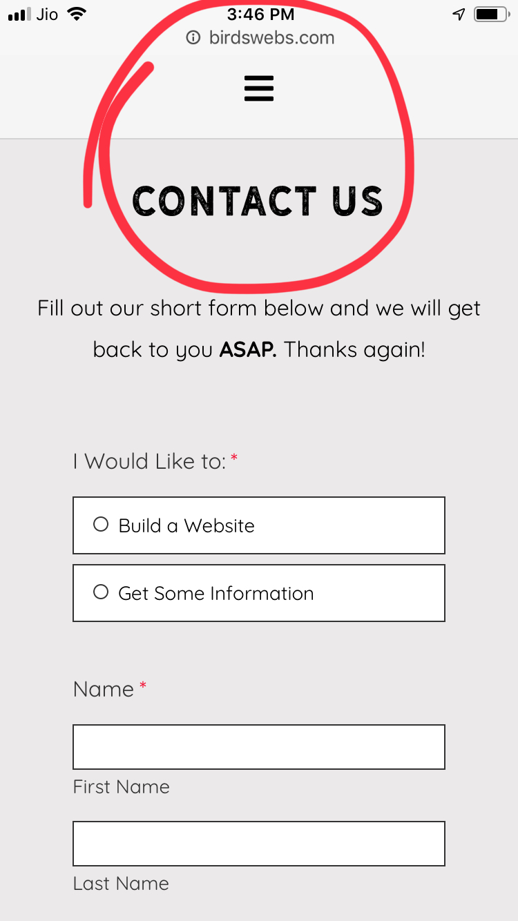
My fixed Mobile Menu initially hides section titles when you first press on a navigation link to go to a section of the page. How can I fix this to where the mobile fixed menu will never hide my section titles? I have attached a screenshot to show you what I am talking about. Thanks in advance!!
Hi @a096399,

Thanks for writing in!
I tested your website on mobile seems the menu is fine. There is no overlapping in any section.

Let us know in which device you have the issue.

Thanks

Hi, thanks for your quick response! The overlapping ONLY occurs when a menu item is FIRST clicked on after FIRST website load. For instance, when I first loaded my website, I instantly clicked on the menu and selected “Website Features”. That is when the website scrolled to the “website features” section and hid the title…just like in the screenshot that I attached in my original post… Please help! I just checked on my phone, cleared my cache and cookies, freshly loaded my website, clicked on “Website Features” in the menu and it is still hiding the section title. Thanks!

Hi again,

Try adding the following code in the Theme Options > JS:

function stop_jumps() {
	jQuery('header.masthead').css('height', jQuery('.x-topbar').height() + jQuery('.x-navbar').height() + jQuery('.x-breadcrumb-wrap').height() + jQuery('.x-logobar').height());
}
jQuery(document).ready(function(){
	stop_jumps();
});
jQuery(window).resize(function(){
	stop_jumps();
});

Don’t forget to clear all caches including your browser’s cache after adding the code. Let us know how this goes!

Hi,

Unfortunately this did not work :frowning:

Hi,

Please remove the js code then try adding this in Theme Options > CSS

@media (max-width: 979px) {
body.x-navbar-fixed-top-active .x-navbar-wrap {
    height: 61px;
}
}

Hope that helps

This topic was automatically closed 10 days after the last reply. New replies are no longer allowed.