Fix menu on mobile

Hello,

When on mobile, on android, the menu is not showing ok

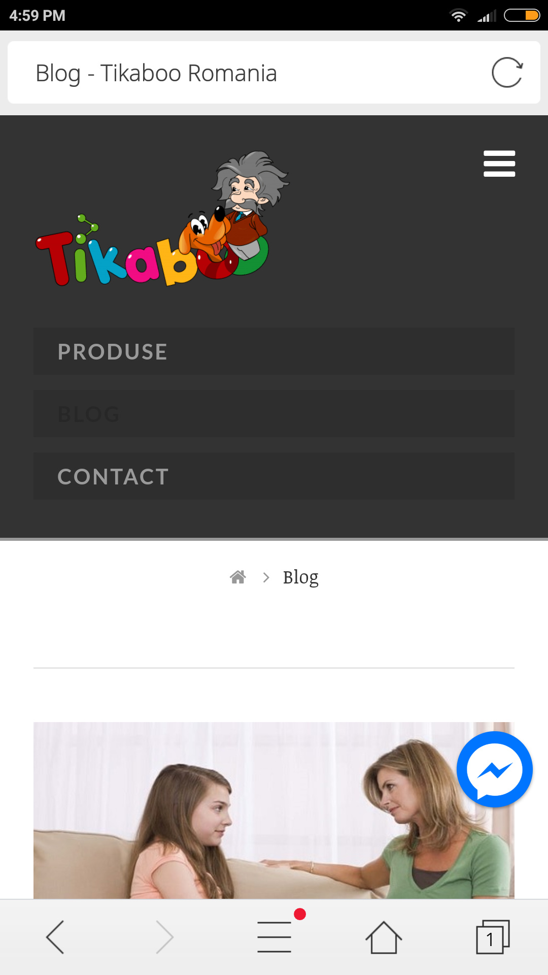
  1. There is an extra row - i draw with yellow

  2. The logo is croped, we have an character and his head is not visibile

  3. The menu is not makins small, it takes a lot of space

Here;s a printscree http://prntscr.com/inzdnw

The site is https://tikaboo.ro/blog/

Can you help me fix it?

Thank you

Hi There,

Please try adding this custom CSS under X > Theme Options > CSS:

@media (max-width: 767px){
    .x-brand img {
        width: 200px;
    }
    #x-btn-widgetbar {
        display: none;
    }
    .x-navbar .mobile .x-nav li>a {
        padding: 5px 1.15em;
    }
}

Hope it helps :slight_smile:

hi, i put the code but it only made the logo bigger.

The menu is still on three rows instead to be hiden in the right page

Thanks

Hi there,

You can decrease the 200px width from the CSS, it’s just added as a sample.

About the menu, what device you’re testing it with? Works okay on my ios and android device. Please clear your browser cache before testing.

Thanks!

Hi,

Here;s what i see http://prntscr.com/ipqxvy

I test on a huawei P10 Lite, but also on mobiletest.me it looks the same

So, can we try something else?

Thank you

Hi,

I am quite confused, can you elaborate what you mean by this and what you would like to accomplished.

"The menu is still on three rows instead to be hidden in the right page "

Thanks

Hi,

here;s a printscreen http://prntscr.com/ipyqp3

The arrows are for the menu items.

The menu should be hidden in the right, and only show if clicked.

Now allt menu is visible and occupy a lot of space.

Thanks

Hey There,

Would you mind providing us with login credentials so we can take a closer look? Please provide following information:

Set it as Secure Note

  • Link to your site
  • WordPress Admin username / password

All the best!

Hi Joao,

i added the login details above.

Thank you

Hi,

I check on android and apple but could not replicate the issue.

The menu only shows up when I clicked on the navbar button.

I also test here - http://mobiletest.me/iphone_5_emulator/?u=https://tikaboo.ro/blog/

Try to clear your browser cache and check again.

Thanks

Hi Paul,

This is realy strange.

I made a video with mobiletestme https://www.useloom.com/share/94202ed503de49f29345fffbd31ce64a

For me on any device the menu is now ok.

I dont know why for you is working and for me no :frowning:

Hi There,

Neither I can replicate the issue, I also viewed your blog site on http://mobiletest.me/ and its fine as well. The mobile menu is not open by default.

I see that your site is under wp-rocket, please clear and deactivate the wp-rocket for a while, also clear your browser’s cache or any caching feature you might have.

Regarding your other issue; this is the Header Widget Areas, you can disable this under Theme Options > Header > HEADER WIDGET AREAS

This is the NAVBAR LINKS HOVER color, it’s very hard to see because it blends with the background-color, you can change this under Theme Options > Header > NAVBAR LINKS HOVER

Hope it helps,
Cheers!

This topic was automatically closed 10 days after the last reply. New replies are no longer allowed.