We have bulleted text in Slider Revolution that’s look great on desktop.
On mobile we’re using a Pro Text Element and the wrapped text does not align with the row above it like on desktop in slider revolution.
How can we fix this?
We have bulleted text in Slider Revolution that’s look great on desktop.
On mobile we’re using a Pro Text Element and the wrapped text does not align with the row above it like on desktop in slider revolution.
How can we fix this?
Hello Websperations,
Thanks for writing in!
Do you want to display it like this?

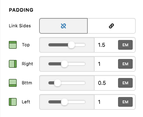
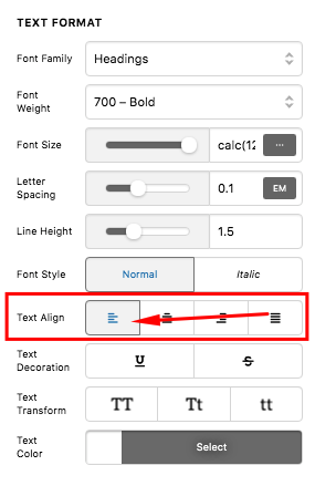
Please remove the left and right padding of the text elements for the list items and the text element of the text above it. You also need to align the text to left side and not to the center of the page.
And by the way, instead of inserting this code:
<p>[x_icon type="check-circle" style="margin-right: 10px; color: #FAC03B;"]Less expensive than college<br />
[x_icon type="check-circle" style="margin-right: 10px; color: #FAC03B;"]Take only career-relevant courses<br />
[x_icon type="check-circle" style="margin-right: 10px; color: #FAC03B;"]More one on one instruction than online schools<br />
[x_icon type="check-circle" style="margin-right: 10px;color: #FAC03B;"]Learn using the processes used in major studios<br />
[x_icon type="check-circle" style="margin-right: 10px; color: #FAC03B;"]Grow with others in a creative environment like no other</p>
You should be inserting this code:
<ul>
  <li>[x_icon type="check-circle" style="margin-right: 10px; color: #FAC03B;"]Less expensive than college</li>
  <li>[x_icon type="check-circle" style="margin-right: 10px; color: #FAC03B;"]Take only career-relevant courses</li>
  <li>[x_icon type="check-circle" style="margin-right: 10px; color: #FAC03B;"]More one on one instruction than online schools</li>
  <li>[x_icon type="check-circle" style="margin-right: 10px;color: #FAC03B;"]Learn using the processes used in major studios</li>
  <li>[x_icon type="check-circle" style="margin-right: 10px; color: #FAC03B;"]Grow with others in a creative environment like no other</li>
</ul>
We would love to know if this has worked for you. Thank you.
Thanks for clarity on how to layout the code. Once the requetsed changes were implemented, the bullets still didn’t line up how we wanted.
We managed to fix this with a class and this CSS.
.slider-bullet-text {
display:block;
margin-left:30px;
}
This issue is now resolved.
Micah
Hey Micah,
We are just glad that you have figured it out a way to correct the said issue.
Thanks for letting us know!
Best Regards.
This topic was automatically closed 10 days after the last reply. New replies are no longer allowed.
