Feature List - Responsiveness

Hi there,

So on my home page at dcgstrategies.com you will see a four column feature list middle of page. The problem I am having is that when I go from 980-1198 or 7680979px the four colums all sqeeze together and formatting gets messed up. When I go to 767px and smaller the four colums go to 4 rows and it looks perfect. How do I fix this? Is there a way to make the columns convert to rows for anything less than 1198px wide automatically?

Thanks - Skeeter
Hi Skeeter,

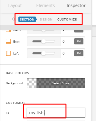
Try adding a unique id to your section element where your feature lists resides.

Then add this code in Theme Options > CSS

@media (max-width: 1198px) {
.my-lists .x-column.x-sm {
    float: none;
    width: 100%;
    margin-right: 0;
}
}

Hope that helps

Hi @paul.r,

So I dropped in your CSS and ID into the section and global CSS with no luck. I’ll reply with login details if that would help. Thanks for your efforts here.

Skeeter

Hi there,

Please try this code instead:

@media (max-width: 1198px) {
    #my-lists .x-column.x-sm {
        float: none;
        width: 100%;
        margin-right: 0;
    }
}

Here are some related links for further reading:

Hope this helps.

@Jade Awesome Stuff this solved it! Thank you

You’re most welcome, Skeeter. :slight_smile:

1 Like

This topic was automatically closed 10 days after the last reply. New replies are no longer allowed.