2 things:
-
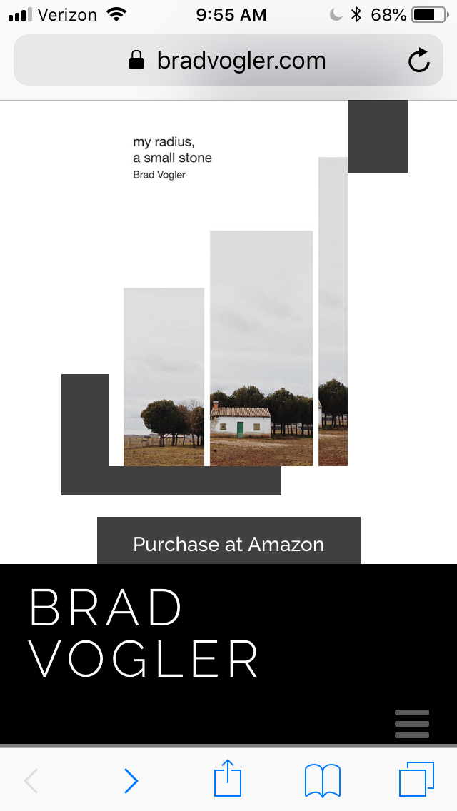
I’d like the hamburger menu in the first screen shot to be on the same line as my name. I looked, but I can’t see what is pushing that hamburger menu down, and I’m not sure what would be easiest to change to fix it.
-
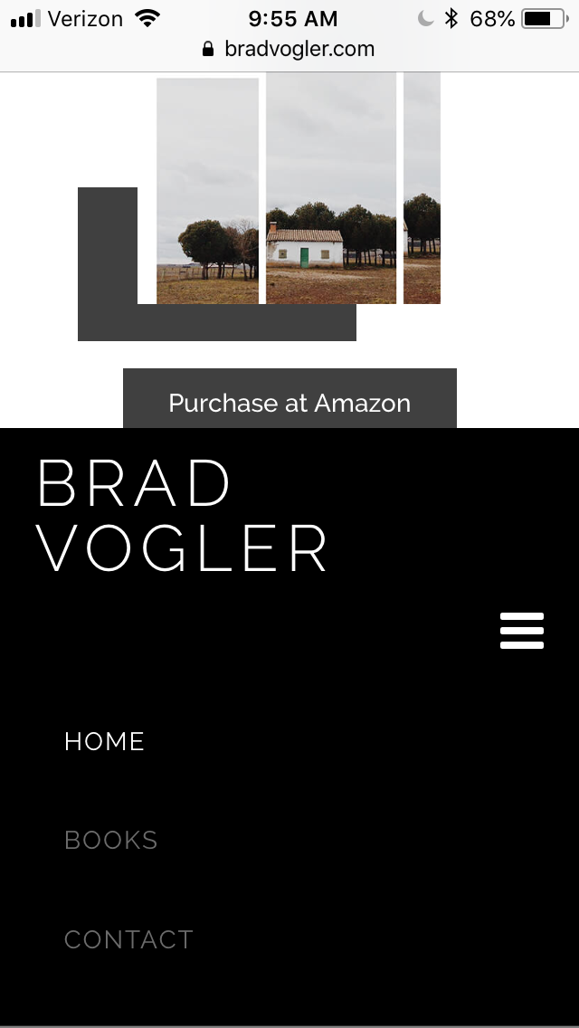
In the second image, with the menu open, everything looks great. When I click to open the menu, I have to scroll down the screen, and I’m worried people might not realize it has opened. Is there a way to have the screen move down when someone clicks to open the menu so they can see the items in it without scrolling?
Thank you again,
Brad