Hi, is possible that i think only homepage is properly size and other page of my website on mobile is more small than home? Is the image more small than image of home. Only for mobile i see this. What is the properly setting to see other page as home? Try on mobile view this ( the first image and content are more smalll) -> https://www.lecartedellamore.it/offerte/ vs https://www.lecartedellamore.it/
Hi @StefanoLisi,
It’s because you added the padding to container on Offerte page:
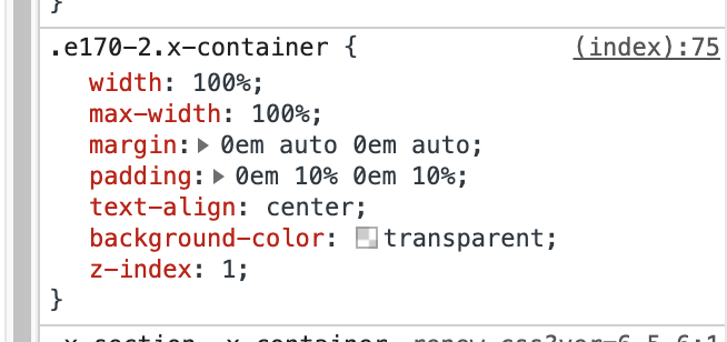
To make the size of images are same as home page, please remove the padding and change the width of container to 88% instead of 100%.
Let us know how it goes!
Hi thanks for the reply. I’ve setted width to 88% ( ) but i don’t find the padding setting and now is more small . I see this on row setting -> https://ibb.co/whrPsfJ
Hi Stefano,
Please try going to X > Settings > User Preferences: Advance Mode: Choose Always On

Check row settings again after that for the padding
Default setting for Font size is usually 1em and not 1px.
1 Like
Yes, I can see there is now less space on the sides. You’re always welcome Stefano!
Cheers.
1 Like
This topic was automatically closed 10 days after the last reply. New replies are no longer allowed.