Hello Ralph,
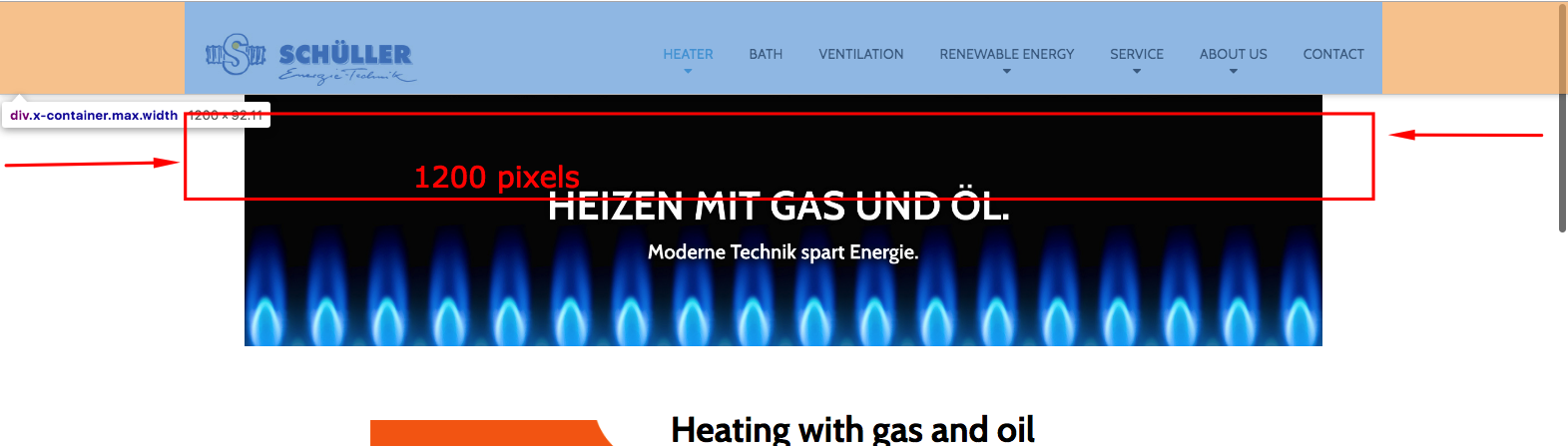
Thanks for writing in! Normally the logo should be at almost in the 20% spacing away from the left of the screen. Since you are using the 1920 pixels with 100% for your content width, the logo now sits almost on the left side. Most desktops has at least 14400 or 1600 pixel width. Wider screens may come with 1920 pixels. To compensate and maintain the content width, we actually set the content width to 1200 pixels only. You can check this setting in X > Theme Options > Layout and Design > Site Max Width.
Now, set the Site Max Width to 1200 pixels only and then set the Site Width to 88% or at least 90%, you should be able to see a difference where in you logo has space from the left and as you resize the browser screen becoming smaller and smaller, the space on the left will also become smaller.
Site Max Width setting:
Site Width setting:
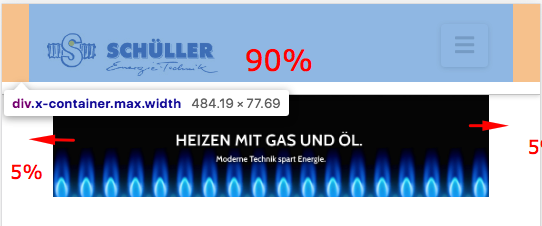
Even if you have a bigger screen, the container of the logo and the navigation will only have a maximum width of 1200 pixels having a width of 88% or 90%. The remaining percentages will be divided into two which will be the space in smaller screens. For example, if your site width is 90%, you will have a space padding on the left side of 5% in smaller screens. You can make the site width 100% percent if you do not want any space in smaller screens.
Hope this makes sense.
