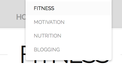
Hi team, my drop down menu displays perfectly on mobile but on laptop, it’s weird. It covers the main menu item and doesn’t drop ‘down’. I’ve attached a screenshot here for your reference. How can I amend this? Thanks, R
Hi @fitnizfury,
Thanks for writing in.
Adjust this .x-navbar .desktop .x-nav > li ul in your custom CSS:
.x-navbar .desktop .x-nav > li ul {
    top: 80px;
}
Hope it helps.
Let us know how it goes.
Thanks.
DIdn’t work 
I’ve sent all the codes I currently have on both Global and additional CSS in my previous post (Secure note)
Hi There,
Thanks for writing in!
I found a custom CSS already in the page but didn’t find it in the previous post.
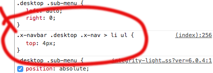
Please search for this CSS
.x-navbar .desktop .x-nav > li ul {
    top: 4px;
}
and remove it. It will fix. If that doesn’t help please add this CSS
.x-navbar .desktop .x-nav > li ul {
    top: 80px !important;
}
Thanks
Worked… thanks so much!
You are welcome 
This topic was automatically closed 10 days after the last reply. New replies are no longer allowed.