Dropdown menu covering other menu items at certain screen widths

Hello, for the most part, our menu is functioning fine. But at screen widths where the logo stacks vertically and the width is not yet small enough for the mobile menu (with toggle button), our dropdown menu isn’t really dropping down – it is covering other menu items. See screenshot below.

Is there a way to force the dropdown menu below the other menu items up until the mobile menu breakpoint?

Hi There @Web_Services

Thanks for writing in! Could you please try adding the following CSS rule into your X -> Theme Options -> CSS area and see if that helps.

@media(min-width: 768px) and (max-width: 1200px){
  .x-navbar .desktop .x-nav > li ul {
    top: 145px;
  }
}

Thanks!

Thanks for the reply!

I tried adding that CSS, but it still not seeing any difference :confused:

Hello @Web_Services,

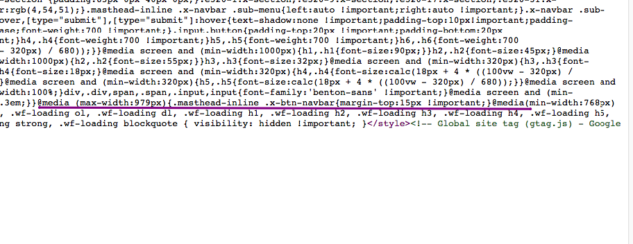
The code should have work. It did not work for you because you have inserted it inside another @media block.

Please double check your code and make sure that you have added the code with the correct placement of the curly braces.

@media (max-width:979px){
     .masthead-inline .x-btn-navbar{
         margin-top:15px !important;
    }
}

 @media(min-width:768px) and (max-width:1200px){
     .x-navbar .desktop .x-nav > li ul{
         top:145px;
    }
}

Hope this helps. Please let us know how it goes.

1 Like

This topic was automatically closed 10 days after the last reply. New replies are no longer allowed.