Drop footer down

Hi
I do not like how the footer comes way up on the page on large screens:

I can add padding to the section but then on mobile there is a huge gap.

Any ideas on how to make the footer appear more uniform place on large screens while not adding a bunch of space on mobile?

Thanks
Hello There,

Thanks for writing in! This issue happened because the total height of your page is less than the height of your browser. To resolve this, please edit your page back in Cornerstone and insert the following custom css in the settings tab, Settings > Custom CSS

@media(min-width: 980px){
  #x-section-1 .x-column{
    min-height: calc(100vh - 169px);
  }    
}

Hope this helps. Please let us know how it goes.

Thanks, but that did not change anything.

Hi there,

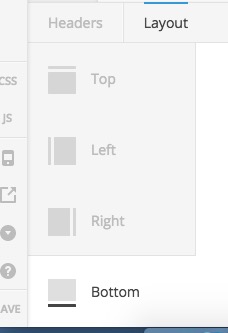
If you want to have the Footer always stick to the bottom of the page I suggest that you go to Pro > Launch > header and add a header and set the location of it to be the bottom. There you will have a sticky footer which will be at the bottom of the website regardless of the height of the content.

You can not force the content has the height of the browser window on all screen sizes.

Thank you.

I will try that!
Thanks

You’re welcome!
Please let us know how it goes.