Dont allow text to break around image on smaller mobile devices

Hey,
If you view my home page here: http://pzu.a90.myftpupload.com/

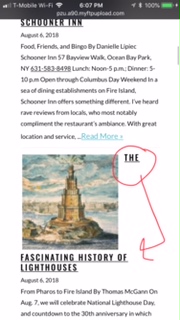
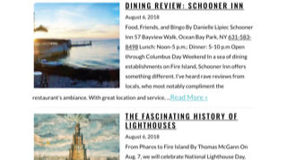
Right below the slider there’s “featured stories” when I view this section on my iphone the heading breaks apart as shown in the uploaded photo. When I view it with my phone in landscape it looks great. How can I get this text to stay together below the photo on smaller screen sizes?
TIA!!!
Rena

Hi Rena,

Thank you for writing in, please add this to Theme Options > CSS

@media (max-width: 480px) {
	.rpwe-img .rpwe-thumb {
		float: none;
		width: 100%;
	}
	.rpwe-block .rpwe-title {
		white-space: normal;
	}
}

More details about float and white-space CSS property.
And finding the proper CSS code selector using the Chrome browser Developer Toolbar

Hope it helps,
Cheers!

Thank you for all the info!

Glad we could help.

Cheers!

This topic was automatically closed 10 days after the last reply. New replies are no longer allowed.