Hi, one more issue. on small screen browsers like laptop or tablets, things are out of the area until zoom out. not sure what I am doing wrong. my requirements are just like this page https://orthodonticlinic.co.uk/.
this website working fine and I have no need to change my zoom settings in the browser.
please guide
Hi There,
Could you please provide us with some screenshots?
I couldn’t replicate this issue on my end.
Thank you.
please check my secure message I have included the domain name and the wp login details.
thanks
regards
JAVED
Hi Javed,
I have just checked your site but I am not certain which images you are referring to as they look normal on my end.
Would you mind pointing out which images are not displaying correctly? Posting screenshots would help a lot too.
Thank you.
Hi Jade, thanks for the reply. well it is not just image the whole website is look too big on laptop because laptop have smaller screen. I have to zoom out till 60 to 65 percent to have a complete website.
it is width of the website which is causing this issue.
I am using 24 inches monitor that why it is looking fine but with other like laptop having issue.
here is the both screen shots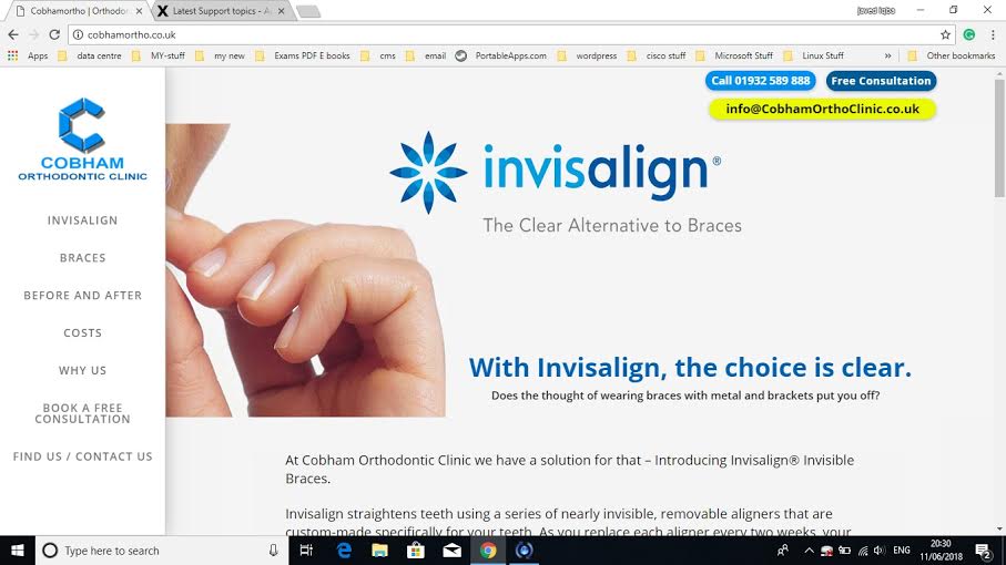
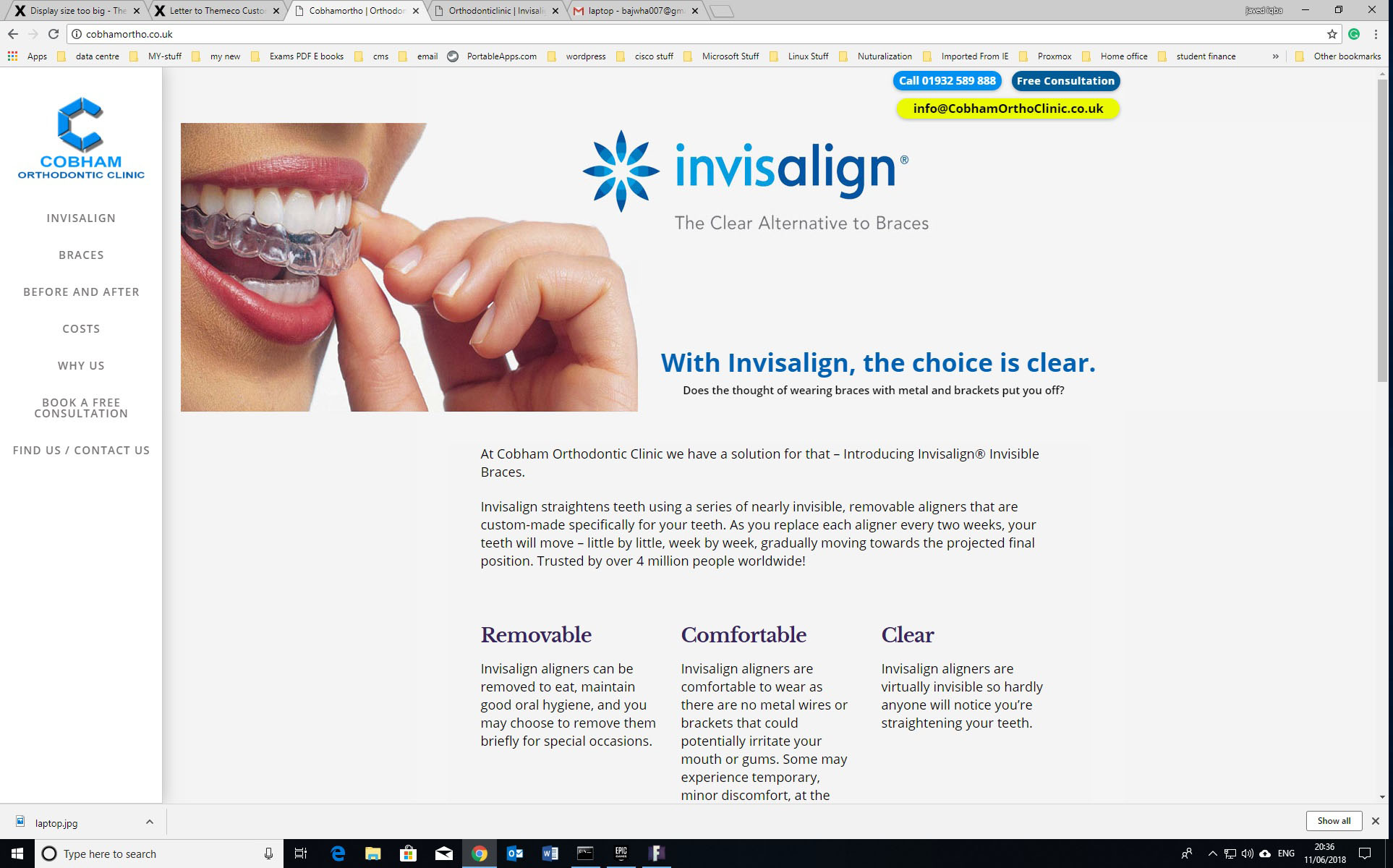
Hi,
Please select Auto Slide Layout instead of Full screen

By selecting Auto the slider will always inherit the width of its immediate HTML container, allowing it to fit seamlessly inside your theme’s page layout.
For more information kindly refer to the link below
https://www.themepunch.com/revslider-doc/slider-setup/#slidelayout
Thanks
This topic was automatically closed 10 days after the last reply. New replies are no longer allowed.