Display problem across multiple computers

Hi - We are testing our website across multiple devices (DESKTOP VIEW ONLY, not yet testing mobile) and noticed that 2 different MacBook Pro’s are displaying the same page in the same browser (Google Chrome and Safari) differently.

Computer #1 -
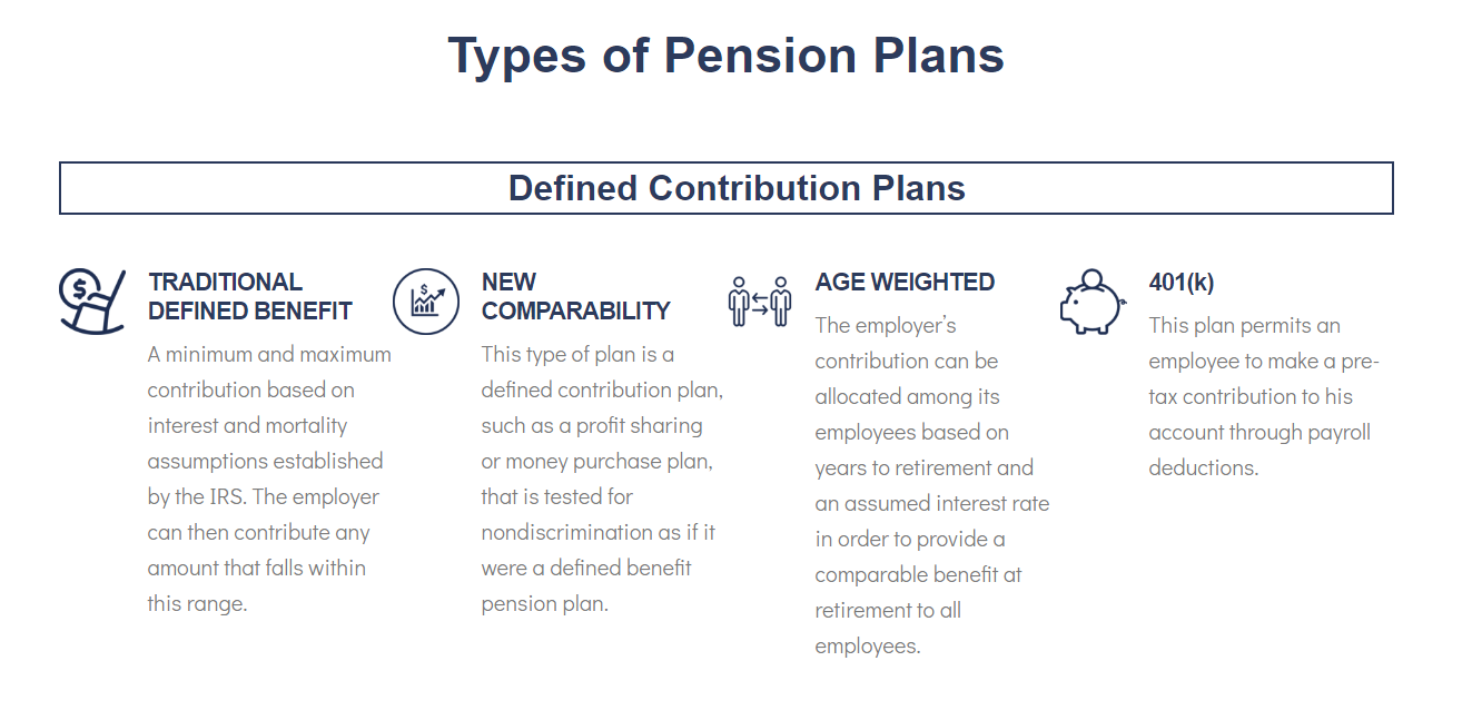
Computer #2 -
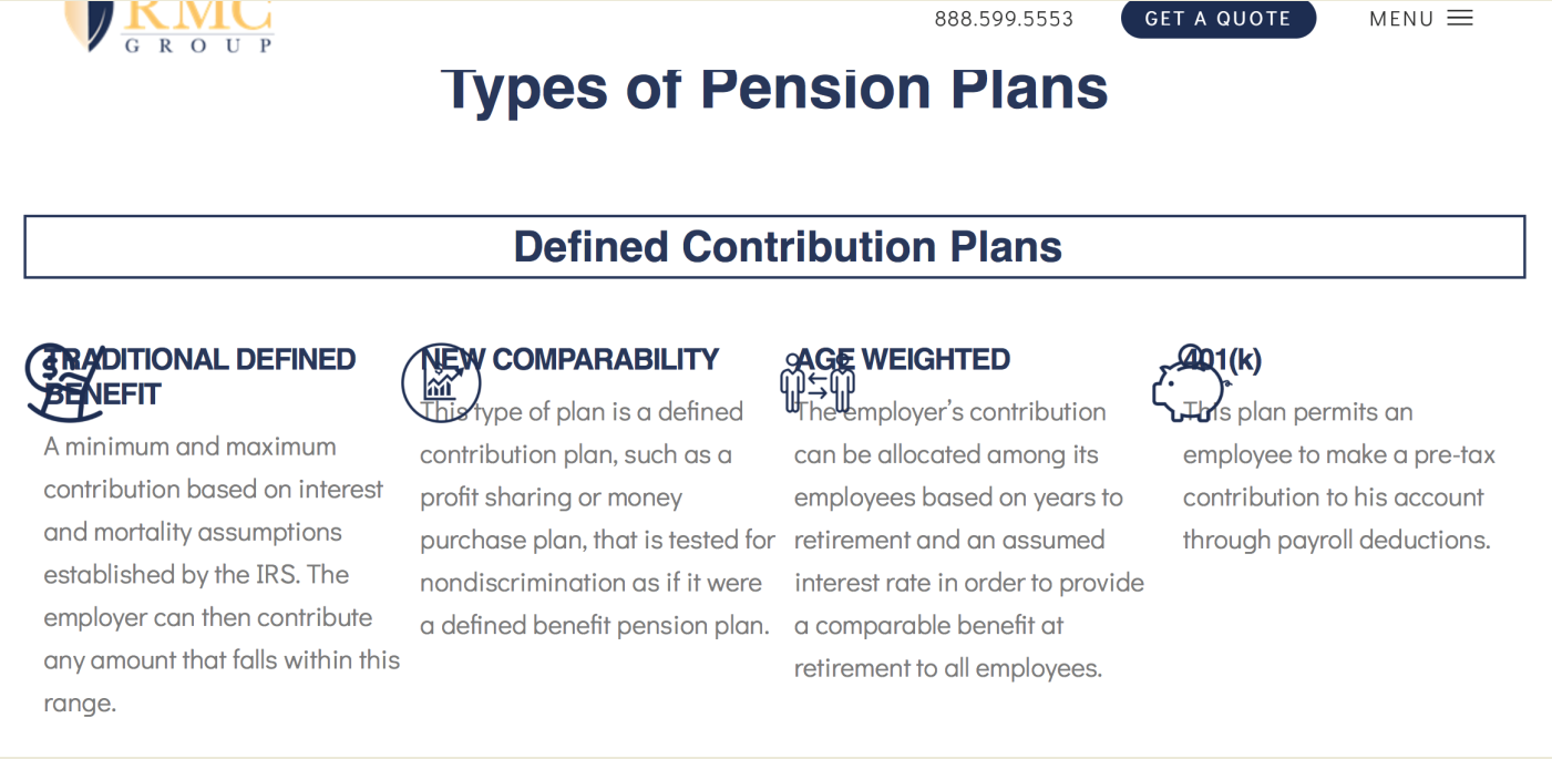
Any idea what’s happening? I know we have some custom CSS that helps us achieve a certain style to those feature boxes, but how do we fix the problem across devices?

Thank you.

Hi There,

Thank you for writing in, what is happening there is in certain screen width the content on the 4 columns does not fit and gets overlap to each other before the 767px hit which is the mobile.

You can add the custom CSS below to your Theme Options > CSS, to stack the columns when they’re about to overlap.

@media (max-width: 1200px) {
	.x-section .x-container.marginless-columns .x-column {
		display: table-row;
	}
}

Hope that helps,
Cheers!

This topic was automatically closed 10 days after the last reply. New replies are no longer allowed.