Different Text Justify on mobile only?

Hey guys, I’ve been with X-theme for a few years now across multiple sites and its worked great!

I am looking for a specific solution for this site https://willcomposeforfood.com/ - I am very happy with the layout and look of the site on a larger screen but since I am altering the text justification in each new section, it looks off on mobile.

What is the best way I can go about better controlling the mobile look of the site? In the meantime I will duplicating all of the text, justifying how I want and hiding/unhiding it based on view but that seems unnecessary.

A quick fix I would love is to just left justify all text when on mobile. Any ideas?
Hello @philkop,

Thanks for writing in!

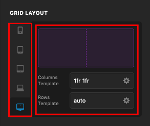
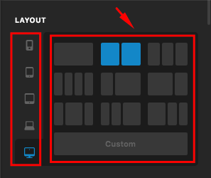
For the layouts, you can always make use of the v2 row element option or the grid layout options. You can easily set the layouts in different screen sizes.

Row Element:
dji0F7sxQpWXXNn3gCJLUA

Gird Element:
eZGbT3HuRCyP979-jJ8XpA

You may need to check out our video tutorials for your layout here:

As for the text alignment, the text align option will be applied for any of the screen sizes. If you need a different alignment in a particular screen size, you will have to add an inline element css instead. Usually, you will find the “Customize” tab and add this code in inline element css:

@media(max-width: 767px){
  $el {
    text-align: left;
  }
}

To learn more about the @media css, please check this out:

This topic was automatically closed 10 days after the last reply. New replies are no longer allowed.