Different breakpoints for different uber menu menus

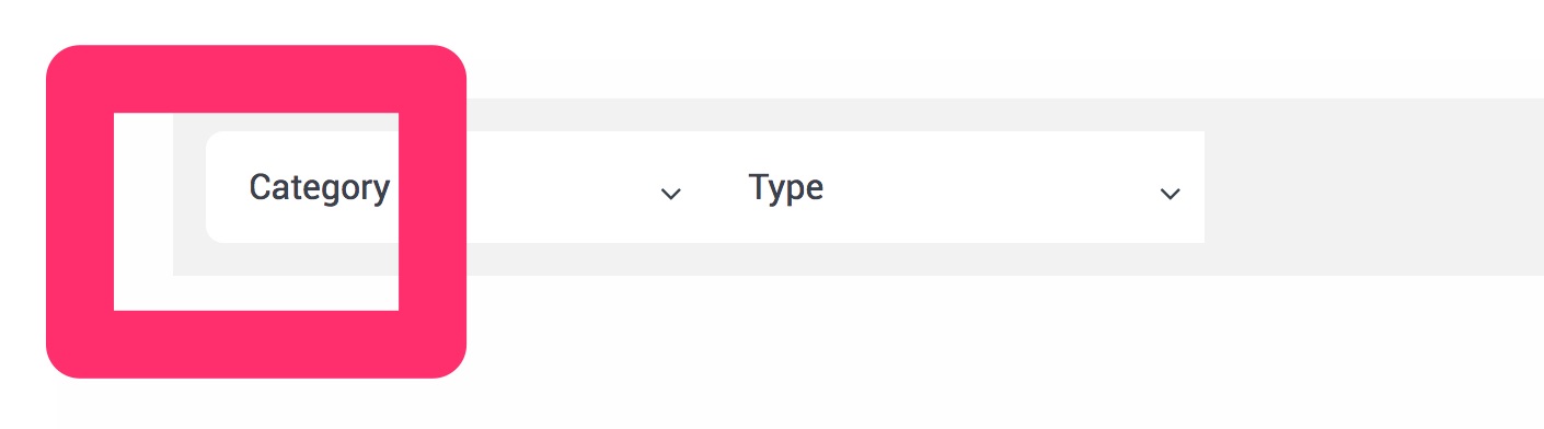
I would like to create a menu that has the same style, functionality, and placement as the one here

Here is the link to the site:

I am little unsure how to do this. I thought the best way to get a customizable menu would be to use uber menu, but I am having problems with the responsive part of the menu.

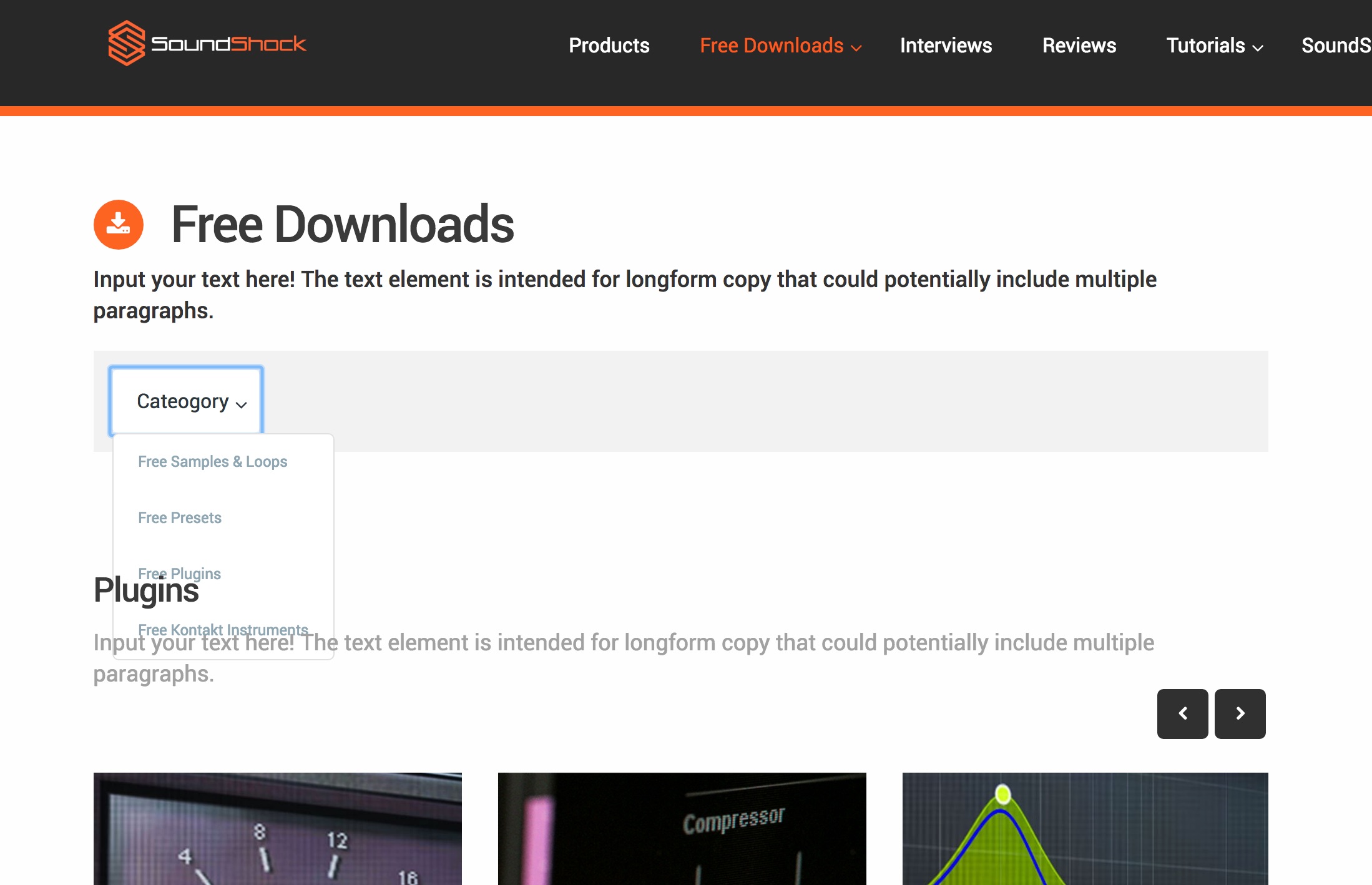
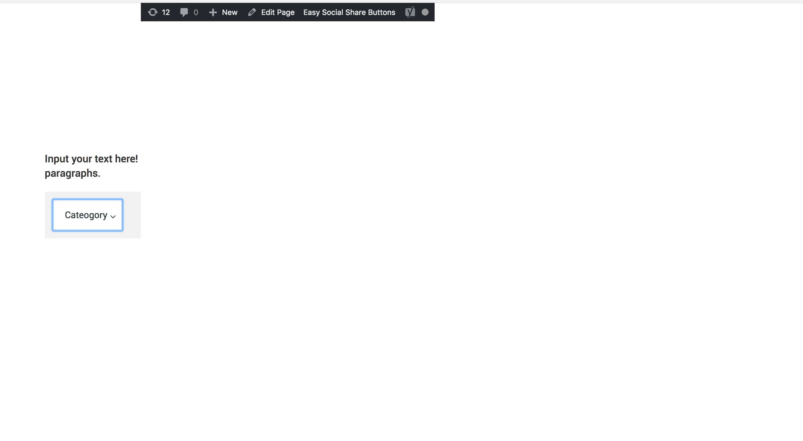
When I go to add a menu in like the one in the photo, the uber menus breakpoints turn the menu into a mobile menu. I would like the full menu to be displayed at all tims

My main menu bar is an uber menu bar.

I can see that you can change breakpoints for uber menu, but this changes all the uber menus.

Can I change the breakpoints of only one uber menu?

Any help on of this or another way of getting a menu similar to the one in the photo would be greatly appreciated!

Hi there,

Unfortunately it is not possible to change breakpoint of only one UberMenu, that will need custom development which is outside of our support scope, To check what you have achieved and see how we can help you guide to correct path would you please kindly give us the exact URL of the page which you have added the menu which is ok on desktop and you do not wish to have it turn to mobile view?

I must say there is a reason that menus change to mobile view, whatever menu you add in desktop will not suite for mobile, so please kindly consider if even we be able to give you a code to override the functionality the desktop menu still may show bad and there will be o solution for this as the main reason desktop menus go to mobile mode is because they show bad in mobile.

Thank you.

Hey,

Here is the URL of the page that I would like to not have it go into mobile view.
http://www.soundshockaudio.com/trial-2/

The main header at the top of the page is fine. but the menu with the category and type looks odd when it goes into mobile view.

I will have a most, three rows of headers in this menu so maybe it won’t be as big of a deal if it is not in mobile view?

I would like it to resize like the one in the photo in my initial message at this URL: https://business.tutsplus.com/categories/software?_ga=2.258344906.1726360601.1513463222-6646232.1502092042

Also, I have a few styling questions:

  1. I have set the menu border radius to 8 and it only seems to be affecting the left side of the menu on this page

    How would I get it to be present on the right side as well.

  2. I would like to divide the different headers into separate white backgrounds like this.

    Would I be able to do this just for this menu?

  3. I would like to change the top level header font size and font weight of the
    “category and type header” only. How would I accomplish this?

Thanks again for all the support! :smiley:

Hi there,

I did check the case and unfortunately, it is not possible to remove the mobile view and keep the desktop for all views. The problem is that there are many aspects to that which is not possible with simple CSS customization. For example, I tried to force the menu to show on all sizes and force the mobile menu to never show. You can do that by adding the CSS code below:

.ubermenu-responsive-toggle {
	display: none !important;
}
.ubermenu {
	display: block !important;
}

But that is not enough, if you check the case you will see the dropdown will not work as there are complicated Javascript aspects there. Unfortunately, you can not do that unless you hire a professional developer to do such a thing for you.

The style changes can be done by the CSS code below:

#ubermenu-nav-main-200 > li {
	margin:  0 10px;
}

#ubermenu-nav-main-200 > li > .ubermenu-target {
	padding:  7px 15px;
	border-radius:  8px;
}

In general, your question is too involved with customisation and unfortunately, we can not be able to assist you further as it goes beyond our support scope. I suggest that you look for a paid developer for this in X Facebook User Group.

Thank you for your understanding.

Hey Christopher. Thanks for the codes on hiding the mobile menu and styling.

I understand that this would need further assistance from a developer.

I have one final question about the menu on this page. There seems to be a bit of a problem with the menu.

Every time I open the menu, it appears under the pages text like in the photo

Is there any way to make it appear over top of the page content?

Also, if you click on “categories,” leave the menu open, open up a new tab in your browser and go back to the page, all the content on the page seems to disappear except for the menu.

Is there any way to fix this also?

Thanks a bunch!

Hi there,

Kindly go to the section which you added the menu inside, and click on the magnifying glass of that section to go to the options of it. Then click on the Customize tab and add z-index: 9; to the Inline CSS option:

That will ensure that the parent of the menu will stay over other sections all the time.

For the second question unfortunately, I could not recreate the issue so I am not sure how I can be of a help.

Thank you.

Great thanks again for the help! Everything seems to be working fine now!

You are most welcome. :slight_smile:

This topic was automatically closed 10 days after the last reply. New replies are no longer allowed.