Customizing Accordion

Hi there,
I got kind of stuck while trying to find answers in the KB. It’s about the accordions I have on my page. This one: https://www.hartig-coacht.de/auftritt/

  1. Is it so that when adding a span color this will only be valid for one paragraph?
  2. Could you please tell me how to change the font and font size of the accordion header? I got lost in all those controls.
  3. And what would I have to add to get a different font color when hovering over the header?

I’d be really grateful for help. Thanks!
Cheers, Karen
1 Like

Hello Karen,

Thanks for writing in!

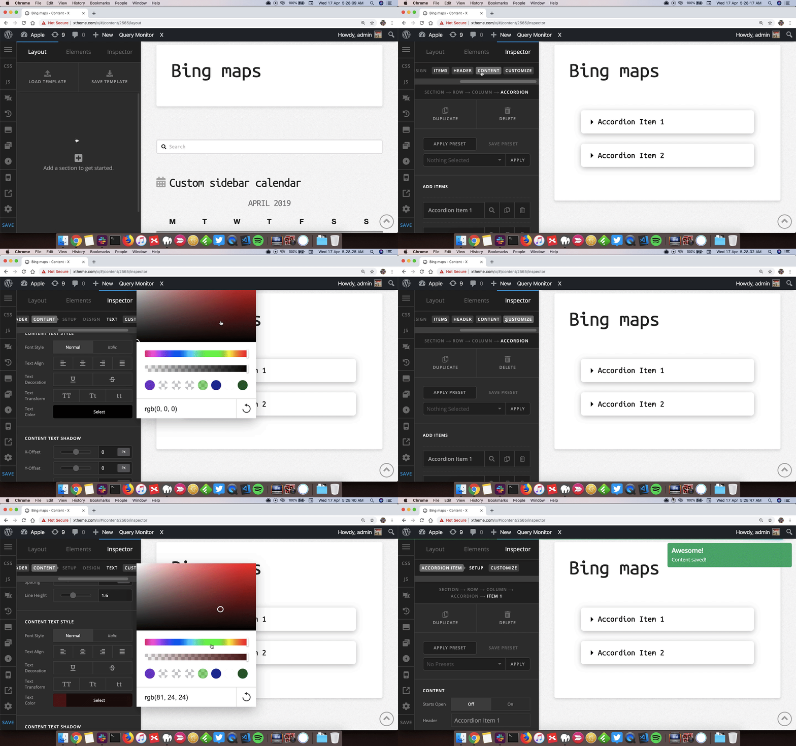
If you are adding a custom Span HTML tag and changing the color of HTML elements inside, yes the changes will be limited to that paragraph. In accordion you can change the color from Content > Content Text Style. Here’s a screencast.

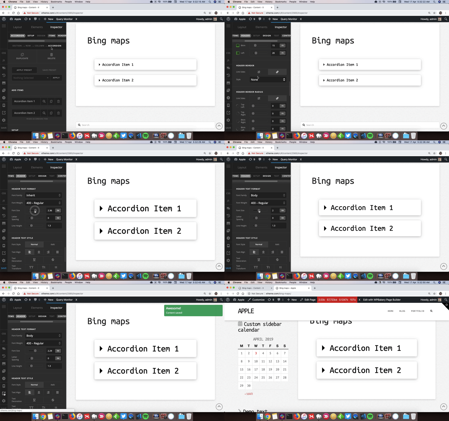
You can change the font size of accordion header from Accordion > Header > Header Text Format. Here’s a screencast that you can take a look.

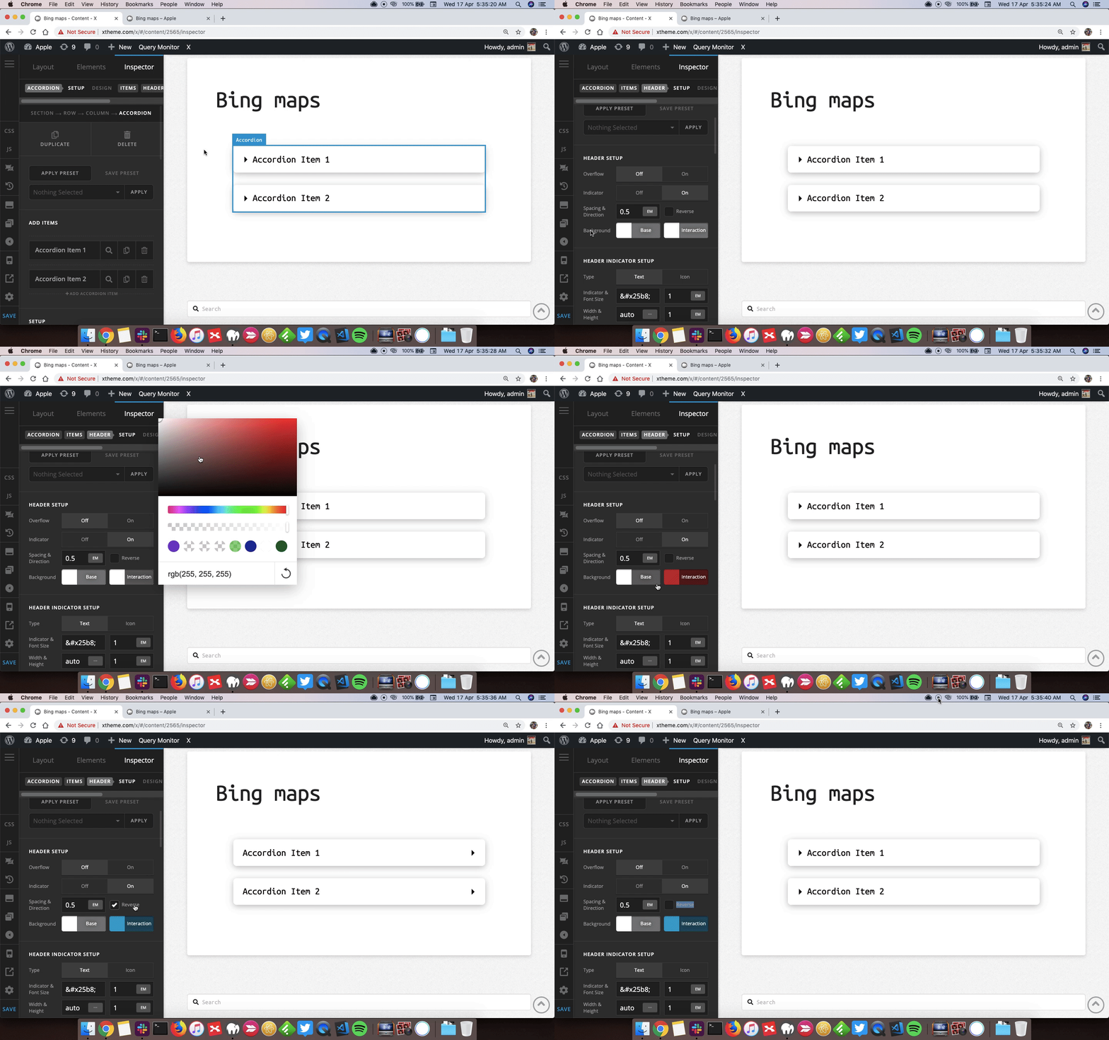
That can be changed from Header > Header Setup > Background > Interaction. Here’s a screencast.

Thanks.

Hi Prasant,
thank you so much for your help and patiently explaining everything! I’m really happy as almost everything worked out fine - actually I hadn’t realized that the navigation bar on top/left could be moved to the right. So all relevant controls simply were “hidden”.
The little things that didn’t work:

  • How would I get the header align with that icon? No matter what I do with padding, the header line will not sit in the middle. See screenshot:

  • With two accordions next to each other, everything is fine on my Mac monitor.

    But when I check mobile view, then the elements are squeezed together. Which control would be the right one to get a little padding so the mobile view will be good? See screenshot:

  • And it would be great if the font size in accordion content would be smaller. Now that doesn’t work, as I only can use the global font, which is 16. The global setting overrules everything. Would some CSS be the solution?

Thanks!
Karen

Hey Karen,

Please edit the content of the accordion header then edit it in HTML mode and remove the <p> tag that wraps the text.

Do you mean you want the two accordions to show up side by side on mobile? The reason why they are stacked on mobile is because you have placed them in two separate columns and all columns collapse and stack on mobile.

If you want to override that default functionality, try adding a class to the row setting that contains the two columns then add this code in X > Theme Options > CSS:

@media (max-width: 767px) {
    .two-columns .x-column {
        width: 48% !important;
        float: left !important;
        margin-right: 4% !important;
    }

    .two-columns .x-column:last-child {
        margin-right: 0 !important;
    }
}

Please note that the code above assumes that the class you have added to the row is two-columns.

Hope this helps.

Hi Jade,
thanks, header is neatly align now! Concerning the colums we had a little misunderstanding, what I was looking for was a way to separate the stacked columns (in mobile view) a little. I just tried inserting a 10px gap - that worked :slight_smile:

Would you have a hint concerning my last question maybe? Is there a way of reducing the font size in accordion content? I can only use the global font size, nothing else is offered and the global setting overrules everything. Would some CSS solve this?

Thank you very much
Karen

Hey Karen,

You would need to use a responsive font size setup (i.e. calc(1em + 1vw)) like shown in this screencast: https://youtu.be/SdQHpAgFumw?t=93

For the Accordion Content, it would look something like the screenshot below. Also remember not to use px as unit.

Hope that helps.

1 Like

Hi Christian,

thanks a lot! As the procedure sounds rather complicated (and I don’t have Pro) I’ll give it a try on my next day off… hope it works out.

Cheers, Karen

You’re most welcome Karen! :slight_smile:

This topic was automatically closed 10 days after the last reply. New replies are no longer allowed.