Hi dear support
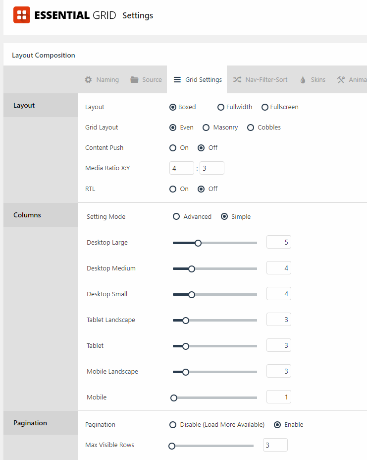
I am looking for a possibility to get a page, to show 3 pictures on Each row - on the “screen” but escpecially on a Phone.
Most Galleries, that I have tried NextGen etc, always put the images under Each-other when changing the resolution like on you phone.
I’d like if possible to have ON the PHONE resolution, 3 pictures on the same row, clickable. (like Instagram)
Is there any possible way with shortcodes or a plugin to get this happening?
Am working on a Beauty-saloon homepage and I’l like to “pictureize” every treatment on a gallery page - as many treatments as possible on one Mobile screen. When clicking on a picture, you would then go to that page of the treatment.
Thanks for your support or ideas! Br A fan of X /Andreas