Howdy, @bracas!
Thanks for writing in! I just wanted to jump in here and provide a little more context for you regarding the v2 Text Element and Headline Element. Some of the ultimate vision for v2 elements is still slightly in flux as we don’t have the templating system in yet, or the ability to set the “global defaults” for them, but everything you’re seeing styling-wise is intentional. I’ll kind of walk through the long-term thought process behind it all:
If you want a true block of content that styling is simply inherited from the theme, you can do this with the Text Element. The Text Element gives you the ability to alter the appearance of the text, and even the container that it all appears in, but overall, unless you adjust the base font-size option, it will effectively remain a mirror of the global options for your Stack as seen in this screenshot:
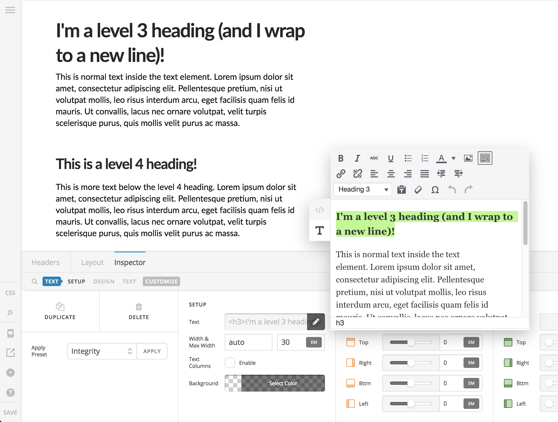
While the Text Element is really intended for long bits of copy (paragraphs, lists, et cetera), you can certainly put a headings in there if needed. A couple discrepancies at the moment: line-height is assigned by the Text Element, which will affect all text items except headings. We will look into this and likely consider adding inherit as the default setting to ensure that it’s not always getting overwritten, but you could set it to match and effectively have a mirror here. The other thing is that when altering something like the color for the entire element, this will not affect headings due to selector specificity. Again, this has mostly to do with the fact that this element is meant for long bits of copy, and not necessarily a mixture of headlines and text, but you can certainly do it. Headlines can have color adjusted individually via the WYSIWYG editor mode if necessary.
Regarding the Headline Element, yes, it will always overwrite everything that might be inherited from the global styles. For the purpose of a page builder, the idea we have here is to give total visual control over the appearance of the element while still being able to specify the value of the element independently. You may need to have a literal h1 element appear similar to your body copy, or perhaps an h6 needs more visual weight. Whatever the case may be, the idea here is to provide flexibility on all fronts from appearance to structure.
How this all pieces together is when the templating system is in (coming up next), you will easily be able to specify your own set of presets for each element to be reused throughout the page as needed. For example, you might take the Headline Element and create 6 different presets, “h1,” “h2,” et cetera (you will be able to name them whatever you want). Once you’ve defined those styles and have them saved as presets (all the sizing, dimensions, colors, design styling, optional graphics or features, et cetera), each time you add a new Headline Element to the page, you can just select the preset you want, and everything will be applied exactly as you want.
Down the road, we are working towards implementing the idea of Global Defaults for each element, which is really the final layer to make things truly user independent. Currently, when you add a button to your page, it will always have the same default look that we have defined as of now to get you started. Well, for a particular project you may have a more specific design idea in mind that you wish to start from every time (say a red button with a pill shape and a more pronounced box-shadow). The Global Defaults will allow you to say, “Whenever I add a button I always want it to start as a red, pill-shaped, shadowy button” and then from there you can apply presets to modify your button further if needed. So you can use this to define how Text Elements, Headlines, et cetera should always look/behave by default when added based on your needs, and then modify independently or with a preset from there.
Hopefully that all makes sense and helps to convey the idea of the full vision a bit more fully and understand how the Text Element and Headline Element are meant to operate in the context of the builder.
Finally, in going back to your original example, what I would do for now is anytime you need a Headline Element with some special styles beyond what is available in the builder currently (such as changing font-size at different breakpoints), I would isolate that to a class (we’ll use custom-h in this example), which you can then add to any Headline Element when needed. So you would define the following in your child theme or in the builder’s global styles:
.custom-h.x-text .x-text-content-text > span {
    white-space: pre-line !important;
    font-size: 2.8vw !important;
}

@media (max-width: 768px) {
  .custom-h.x-text .x-text-content-text > span {
    font-size: 6.2vw !important;
  }
}

@media (max-width: 480px) {
  .custom-h.x-text .x-text-content-text > span {
    font-size: 8vw !important;
  }
}

@media (max-width: 320px) {
  .custom-h.x-text .x-text-content-text > span {
    font-size: 7vw !important;
  }
}
And then whenever you need to utilize those styles, you just add that class to the element like so:
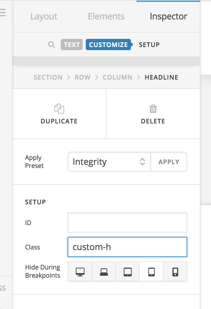
You shouldn’t need to use !important as long as your selector is specific enough. The selector for the primary Headline Element text is like that as it allows for subheadline text as well, so each line needs to be styled independently. Otherwise, we work to keep our selector specificity as short as possible.
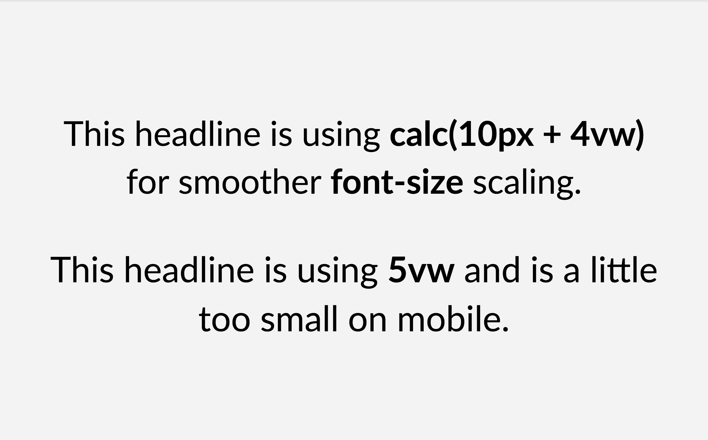
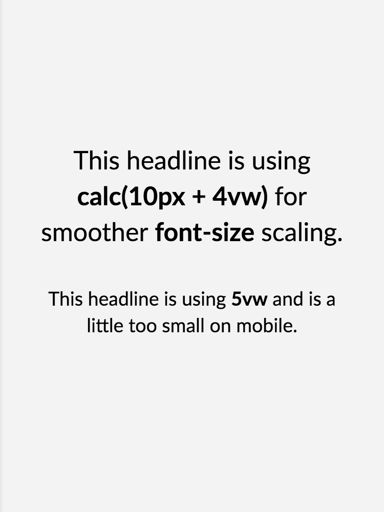
Bonus content: I notice from the CSS you’ve provided that you’re adjusting the font-size at different breakpoints because the value of the unit you’re using (vw) needs to be tweaked slightly to get your sizing just right. A really great trick I love to use instead is to utilizing calc() and combining a base px unit with a vw unit, which allows for much more even scaling that isn’t too drastic on larger screens or too small on mobile devices. Here’s a couple screenshots demonstrating the difference in the two approaches, below is on a large desktop:
And this would be on mobile:
Hopefully that all helps to point you in the right direction…cheers!
