CSS not smooth on mobile version

Hi,
In my main page: learn.mobileodt.com I put in CSS for the widget, but when I view the page in mobile view the lines are overlapping. Attached an image to show what I mean.

Can you help?

Thanks!
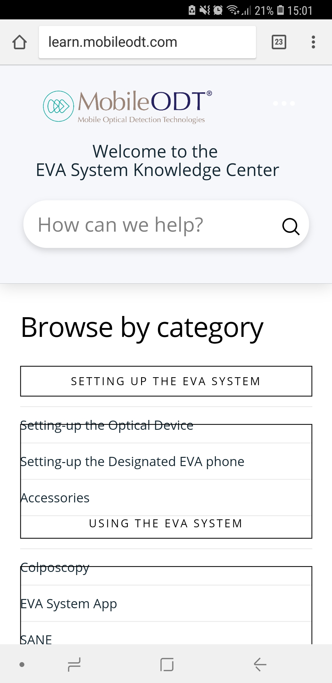
(For some reason when I look at the question I just posted the problematic part of the image is cut). You can see it if you go to the page in mobile view.
Hi There,

To fix this issue, please add this custom CSS under Theme Options > CSS:

h4.h-widget {
    clear: both;
}

If you would like to learn CSS, I am sharing few resources that you take a look to get started with CSS and an interesting tool that you can use to speed up the development process.

I recommend you to watch following video that will help you to get started with CSS.

https://www.youtube.com/watch?v=MFR4WXiLzpc

Sometimes it can get a bit difficult to find out the right selector to be able to write the required CSS codes. A handy tool that can help you in this is Google Chrome dev tools. I am sharing the resource that you can refer to get started with dev tools.

https://developers.google.com/web/tools/chrome-devtools/css/

https://developers.google.com/web/tools/chrome-devtools/

https://www.youtube.com/watch?v=tP_kXBJWPhQ&t=200s

Hope this helps!

Hi,
Thanks! I tried that but still no luck and it’s still not showing properly.
Any thoughts?

Hi again,

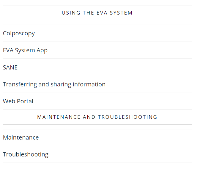
I tested the above code using developer’s tool and it works fine (see screenshot)

This looks like a cache issue, I noticed the content on your site is being served by the cache. Always make sure to purge all caches (browser, plugin or CDN if using) after making any change to see the changes right away on the front-end.

Try clearing out the cache and check the site again.

Let us know how this goes!

This topic was automatically closed 10 days after the last reply. New replies are no longer allowed.