Hi There,
I have two issues I am trying to address with css, and I have been unable to solve them.
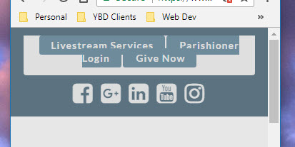
The first is how a menu is displaying in the footer. I do not want the border to show. Below is the css I am using.
div#nav_menu-15.widget.widget_nav_menu {
margin-top: 44px !important;
}
div#nav_menu-15.widget_nav_menu ul>li a {
background-color: transparent !important;
text-shadow: none !important;
border: none !important;
color: #100001 !important;
}
div#nav_menu-15.widget_nav_menu ul>li a:hover {
background-color: transparent !important;
text-shadow: none !important;
border: none !important;
color: #f3f4f4 !important;
}
ul#menu-footer-custom.menu {
width: 70% !important;
border: none !important;
box-sizing: none !important;
}
Second problem,
The topbar, and the button links I’ve place there are not resizing properly when viewed in portrait mode on a smart phone.
I’ve tried this css, and it doesn’t work
@media (max-width: 767px) {
.topbar-button-child {
margin-bottom 12px !important;
}
}
What am I missing with these two issues?
The website is: https://www.saintjamespreschool.com/
Thanks very much for your help!
Best Regards,
Nancy