Hi,
I would like to create a specific order of elements for mobile design in CSS.
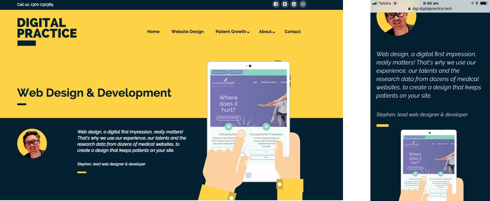
In the desktop/laptop version (see left image) the ipad image is the third column of the dark blue banner section.
For mobile designs (right image), the ipad image should be positioned below the text and yellow small stripe, as in the example. (To create this mobile image, I used Cornerstone (hiding for desktop and laptop versions)) How do I create the same effect with custom CSS? Rather than using a specific MOBILE SECTION as I did now in Cornerstone, I want to automate it with CSS so that every new page will have an automatic mobile version too.
I already created CSS classes, and currently the class .welcome-image (which is the ipad), is not displayed on mobile versions, because it was overlapping the text. I couldn’t figure out the CSS to position it as in the example above. Hope you van assist me.
Thanks for your help!
Els
