Creating related links with image, text hover effect

Hi there

I would like to place some related links at the Bottom of a page to discover more Content, like I did at the Bottom of this page: https://tuccillo.showmyproject.ch/publikationen/publikationen-und-auffuehrungen/

I have added three columns with Background Images and text Elements. Is it possible to make links from this columns, Maybe with a hover effect with CSS?

Or is there a easyer solution for what I try to acheive?

Thank you very much for your help!
Hi Felix,

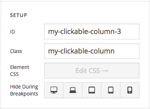
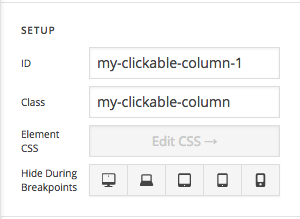
Thanks for writing in! This is possible with some custom CSS and JavaScript. First assign CSS IDs and Classes to your Columns as follows (use same CSS class for all the Columns and use a unique ID for your CSS IDs)

Then you can add the following JavaScript code into your page’s JS section and then you can change the links accordingly.

jQuery(document).ready(function($){
	$("#my-clickable-column-1").wrap('<a href="http://lawnmowershop.co.nz/link-1/" />');
	$("#my-clickable-column-2").wrap('<a href="http://lawnmowershop.co.nz/link-2/" />');
	$("#my-clickable-column-3").wrap('<a href="http://lawnmowershop.co.nz/link-3/" />');
});

Finally you can add the following CSS rule into your page’s CSS area.

.my-clickable-column:hover {
    opacity: 0.5;
}

Please note that custom coding is outside the scope of our support. Issues that might arise from the use of custom code and further enhancements should be directed to a third party developer.

Hope that helps.

Hi mldarshana

Thank you very much for your help! I have realised the links without the jQuery, because with this code the columns have lost their space between.

Is it possible, to give columns a margin around? Also on top and bottom? So that the he columns have a space between even when they are on top each other like on a smartphone.

Thank you very much for your help!

Hey Felix,

I see you’ve given a class my-clickable-column to all of your columns, so let’s use a dynamic approach here, just paste the following script in the Theme Options > JS:

jQuery(document).ready(function($){
	$(".my-clickable-column").each(function(){
		$(this).wrapInner('<a href="'+ $(this).find('a').attr('href') +'"></a>'); 
	})
});

Then make sure to remove the padding from the columns and paste the following code in the Theme Options > CSS:

.my-clickable-column > a {
    display: block;
    padding: 50px 20px;
}

This would make all of your columns clickable without disturbing the columns layout. To have top bottom spaces in mobile devices, you can use this code:

@media screen and (max-width: 767px) {
    .my-clickable-column {
        margin-bottom: 20px;
    }
}

Don’t forget to clear all caches including your browser’s cache after adding the code. Let us know how this goes!

Hi Nabeel

Thank you very much for updating the code! The space between top and bottom on mobile devices works perfect.

The combination of column ID “my-clickable-column-1” etc. and this code

jQuery(document).ready(function($){
$("#my-clickable-column-1").wrap(’’);
$("#my-clickable-column-2").wrap(’
’);
$("#my-clickable-column-3").wrap(’
’);
});

still removes the space between the three columns.

I think I do something wrong, so I removed the jQuery and gave each text the link to the corresponding content.

Thank you very much for your help.

Glad you’ve sorted it out :slight_smile:

This topic was automatically closed 10 days after the last reply. New replies are no longer allowed.