Hello Vivien,
Thanks for writing in!
The headline is using a custom HTML with custom CSS code. In the headline, this HTML code was inserted:
<span><span class="h-sup">Take a Moment to</span><br>
Explore our rooms.
<hr></span>
And then in the Headline > Customize > Class, the custom h-responsive h-custom-headline class was inserted.
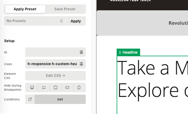
And then in the global CSS, this custom CSS was inserted:
.h-sup {
  display: block;
  margin-right: -0.15em;
  margin-bottom: 0.5em;
  font-family: "Open Sans", sans-serif;
  font-size: 0.3em;
  font-weight: 300;
  letter-spacing: 0.15em;
  line-height: 1.6 !important;
  text-transform: uppercase;
  color: inherit;
}

.h-custom-headline hr {
  width: 50%;
  max-width: 300px;
  height: 3px;
  margin: 1.5em 0 0;
  border: 0;
  font-size: 0.3em;
  background-color: #e44065;
}

.h-custom-headline.cs-ta-center hr {
  margin-left: auto;
  margin-right: auto;
}

.h-custom-headline p,
.h-custom-headline br {
  display: none;
}
The custom CSS sets the font size and the other font of the headline.
As for the grid with 2 pictures, it also consists of. a custom HTML and with custom CSS.
<div class="x-bnb-image-grid">

  <a href="http://demo.theme.co/bed-and-breakfast-v2/accommodations/murphy-standard/">
    <span class="bg"><img src="https://dev-x-monthly-challenge.pantheonsite.io/wp-content/uploads/2020/12/bg-standard.jpg" style="height: 100%;width: auto !important"></span>
    <div>
      <span>Murphy Standard</span>
      <small>From $149 a Night</small>
    </div>
  </a>

  <a href="http://demo.theme.co/bed-and-breakfast-v2/accommodations/murphy-exclusive/">
    <span class="bg"><img src="https://dev-x-monthly-challenge.pantheonsite.io/wp-content/uploads/2020/12/bg-exclusive.jpg" style="height: 100%;width: auto !important"></span>
    <div>
      <span>Murphy Exclusive</span>
      <small>From $289 a Night</small>
    </div>
  </a>

</div>
And then in the global CSS, this custom CSS was added:
/*
// Image Grid.
*/

.x-bnb-image-grid {
  display: -webkit-flex;
  display: flex;
  -webkit-flex-flow: row wrap;
          flex-flow: row wrap;
  -webkit-justify-content: space-between;
          justify-content: space-between;
  -webkit-align-items: stretch;
          align-items: stretch;
  margin: -10px;
}

.x-bnb-image-grid > a {
  display: -webkit-flex;
  display: flex;
  -webkit-flex-flow: column nowrap;
          flex-flow: column nowrap;
  -webkit-justify-content: flex-end;
          justify-content: flex-end;
  -webkit-align-items: flex-start;
          align-items: flex-start;
  -webkit-flex: 1 1 360px;
          flex: 1 1 360px;
  overflow: hidden;
  position: relative;
  z-index: 1;
  margin: 10px;
  min-height: 300px;
  font-size: 2rem;
  box-shadow: 0 0.25em 1.5em rgba(0, 0, 0, 0.35);
}

.x-bnb-image-grid > a:before {
  content: "";
  display: block;
  position: absolute;
  z-index: -1;
  top: -5px;
  left: -5px;
  right: -5px;
  bottom: -5px;
  background-color: rgba(21, 21, 21, 0.65);
  transition: background-color 0.5s ease;
}

.x-bnb-image-grid > a:hover:before,
.x-bnb-image-grid > a:focus:before {
  background-color: rgba(21, 21, 21, 0.35);
}

.x-bnb-image-grid > a:hover > .bg,
.x-bnb-image-grid > a:focus > .bg {
  transform: scale(1.1);
}

.x-bnb-image-grid > a:hover > div > small,
.x-bnb-image-grid > a:focus > div > small {
  color: #ffffff;
}

.x-bnb-image-grid > a > .bg {
  display: block;
  position: absolute;
  z-index: -2;
  top: 0;
  left: 0;
  width: 100%;
  height: 100%;
  background-position: 50% 50%;
  background-size: cover;
  transition: transform 0.5s ease;
}

.x-bnb-image-grid > a > div {
  width: 100%;
  padding: 1em;
  font-size: 1em;
  line-height: 1;
}

.x-bnb-image-grid > a > div > span {
  display: block;
  overflow: hidden;
  font-size: 1em;
  line-height: 1.2;
  text-overflow: ellipsis;
  white-space: nowrap;
  color: #ffffff;
}

.x-bnb-image-grid > a > div > small {
  display: block;
  overflow: hidden;
  margin: 0.35em 0 0;
  font-size: 0.575em;
  font-weight: 700;
  letter-spacing: 0.065em;
  line-height: 1.4;
  text-overflow: ellipsis;
  text-transform: uppercase;
  white-space: nowrap;
  color: #ffffff;
  transition: color 0.5s ease;
}


/*
// Room Column Intro.
*/

.x-bnb-room-col-intro {
  padding: 0 0 14px !important;
}

@media (min-width: 768px) {
  .x-bnb-room-col-intro {
    padding: 1px 0 0 !important;
    text-align: right !important;
  }
}
Hope this helps.


 Yes for now it helps, I will try to wriggle myself through it
