Im having a terrible time making the Content Dock be fully visible on iphone. its half cut off and the close button isnt visible either.
My Website is
Hello @thejeffklein,
Thanks for writing in!
I have checked your content dock and it seems it is way wider than the mobile device screen. To get this resolve, please follow this:
-
Set the width of the content dock to at least
320pixels or less.
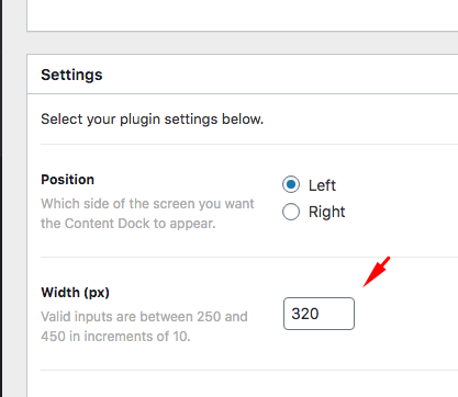
-
Since the default z-index of the content dock is only 1050, you will need to edit your custom header and change the z-index in the bar settings to
1049or less so that the content dock will always be on top and visible.
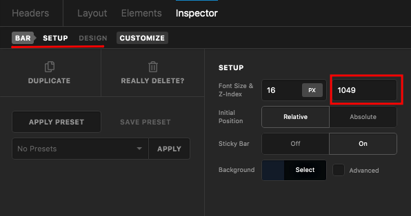
We would love to know if this has worked for you. And if nothing is helping, provide us access to your site so that we can check your settings. Please create a secure note with the following info:
– Link to your site
– WordPress Admin username / password
To know how to create a secure note, please check this out: https://theme.co/apex/forum/t/how-to-get-support/288

Thank you.
Hm. Still not working. Also, now the desktop version is skinny and wonky. is there a way to have smaller on mobile but 450 on desktop?
Hello @thejeffklein,
The given credentials is not working. It seems that it is incorrect.
Please double check.
I have checked your site again and you haven’t edited the z-index of the bar settings. Anyway, to get this resolve, please add the following CSS code in the X > Theme Options > Global CSS (http://prntscr.com/evui3r)
@media(max-width: 767px){
    .tco-content-dock {
        max-width: 90%;
        z-index: 16000;
    }
}
We would love to know if this has worked for you. Thank you.
Still not working. I jus re-added those credentials. they should work now. sorry
Hello @thejeffklein,
Thanks for providing the details.
Please try adding this code in the Global CSS:
.tco-content-dock {
    z-index: 99999 !important;
}

@media (max-width: 767px) {
    .tco-content-dock {
        max-width: 90% !important;
    }
}

@media (max-width: 480px) {
    .tco-content-dock {
        font-size: 0.75em !important;
        max-width: 250px !important;
    }
}
The last block of code above will set the font-size of the content dock smaller and limit its width to 250px on smaller devices.
Kindly note that since this is a custom code that changes the default behavior/display of the theme, you will be responsible to maintain or update the code in case you require further changes or if the code stops working in future updates. If you are uncertain how to proceed, it would be best to get in touch with a developer.
Hope this helps.
thank you so much. it worked
You’re more than welcome, glad we could help.
Cheers!
This topic was automatically closed 10 days after the last reply. New replies are no longer allowed.