Content Area Dropdown on Mobile

Hello,

I’d like to set the width of a content drop down area box to have a “width” of 25 for 480px & smaller but 35 for 481px-767px and 45 for 768px-979px and the same for the rest of them (980px-1199px -> 1200px +)

Are you able to tell me how I can achieve that on the content area drop down? Does this require css or can i do it right in the settings some how?

Will put more info in the secure note.
Hi There,

Thanks for writing in!

if I clearly understand your concern regarding the. content aria dropdown width, which doesn’t need a custom CSS to adjust the width.
You can change or adjust the width itself in the editor.

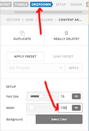
please click on the drop-down tab on the header of the element and in the setup section, you can adjust the size.

Hope this is something you are looking for.

Thanks

Thanks, understand that - but how can I control the width there based off different screen sizes?

Hi There,

Thanks for writing in!

You can adjust the width of the different device using a media query.
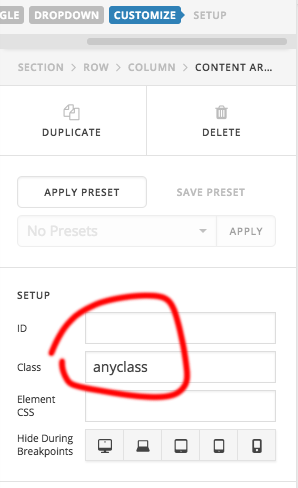
Give a custom class name to the element.

For example:

@media (max-width: 650px) {
  .x-dropdown.anyclass {
  width: 450px;
}
}

You can repeat this for different device size and the CSS should go in Theme option-> global CSS

Hope this helps!

Hello,

I’ve gone ahead and put this in the global css:

    @media (max-width: 280px) {
    .x-dropdown.bookingform {
    width: 450px;
    }
    }

    @media (max-width: 481px) {
      .x-dropdown.bookingform {
      width: 650px;
    }
    }

    @media (max-width: 768px) {
      .x-dropdown.bookingform {
      width: 650px;
    }
    }

However no changes are being made after i add the class “bookingform” to the drop down content button.

I’ll include the login if you want to check in a secure note… Thanks very much for your assistance.

Hi There!

Thanks for writing in!
Please add this CSS instead of the above.

@media only screen and (max-width: 768px) and (min-width: 482px)  {
    .x-dropdown.bookingform {
      width: 650px !important;
    }
}

@media only screen and (max-width: 481px) and (min-width: 281px)  {
    .x-dropdown.bookingform {
      width: 450px !important;
    }
}
@media only screen and (max-width: 280px)  {
    .x-dropdown.bookingform {
      width: 250px !important;
    }
}

Let us know how this gors.

That did it, thank you very much!