Hello,
I’ve added a 3rd container in the header bar menu here, how can i align the first (logo) and 2nd (words) on the left and the 3rd (menu) on the right ?
Hi There,
You need to change the Horizontal Align of the bar to space around or space between.
I actually would set just 2 containers, first container I would put the logo + headline and set the container as a row instead of a column, so the headlines would be closer to the logo.
Hope it helps
Ok thx !
How can i get the logo always having the same size when screen become narrow, i don’t see why he resizes because there is enough space for it, the round menu also resize.
What i got :

What i would like :

Do you know if there is solution for the - to diseapear at the end of words when the headline is on 3 lines ?
Hi There,
For the Logo, please disable Retina option:
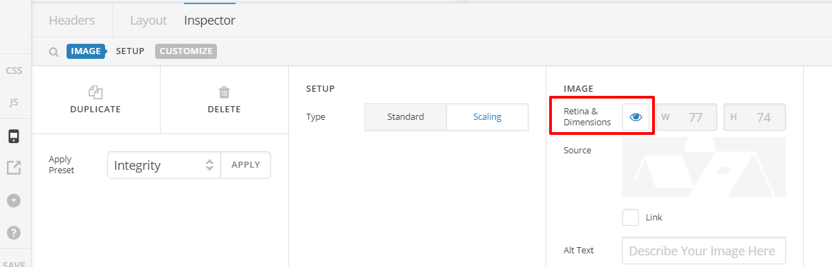
To understand Retina Image functionality, see this: https://www.elegantthemes.com/blog/tips-tricks/how-to-create-retina-display-image-assets-for-better-looking-websites
For the menu button, it happens because you have set flex basis to auto. When the text auto adjust and when two words on the middle is taking to much space, the space left for the menu button is not enough so it squeeze. On the FLEX BASIS option of each container, replace auto with 70% and 30% accordingly. 70% for the first container and 30% for the last container with the button.
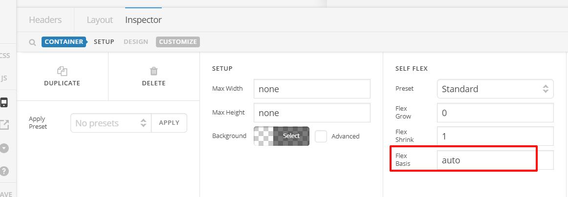
For the text, hide the current text element on mobile view using HIDE DURING BREAKPOINTS, then let’s just add another text element that is HIDDEN on desktop. This time, let’s make the text in 3 lines by default by using the following:
Couverture <br> Charpente<br>Maison bois
See how we replace the dash with a break element. This will make sure that on mobile, there’s no dash and consistent 3 lines.
Hope this helps.