Google Search Console is telling me under Mobile Usability that my Viewport is not set and that my font is too small to read. How do I configure my Viewport?
Hey @socrammtz,
I checked both your sites and they are responsive. The Viewport meta is also standard in X and it’s there in the source code of your site. It’s not a configurable part.
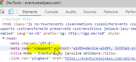
Please contact Google support to notify them that the Viewport meta is present.
Regarding the small font, in X > Theme Options > Typography, try increasing the Root Font Sizes.
Thanks.
Hello @socrammtz,
Thanks for asking. 
By default X Theme works absolutely fine on most of the screen sizes, until and unless some changes has been made that changes the responsive nature. I checked your websites and here’s I am listing down few things that you can do:
- I tested the website on dev tools and can see that the font size for mobile device is a bit small to read. Under X > Theme Options > Typography > Root font size please change the values as per your requirement. To understand the options presented there, please take a look at following ticket.
2. I also see that there is no space in between screen edge and the container. Please see screenshot. https://cl.ly/de9927ab6e3b
Please inspect the Section > Row and give some padding.

- Same is the case with https://eventureselpaso.com/, wherein font size is a bit small for mobile devices. Please take a look at the solution mentioned in the first step.
Let us know how it goes.
Thanks.
This topic was automatically closed 10 days after the last reply. New replies are no longer allowed.