Hello support team!
I’m having some issues with the compatibility of theme x (PRO) with different browsers. When I check the different browsers, there are some issues. I’ll list them below and hope you can provide me some guidance in solving this issue.
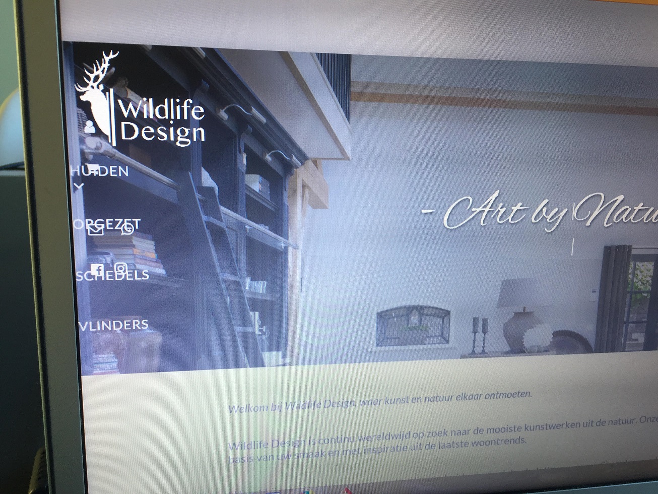
Internet explorer - problem with alignment of the header (and footer):
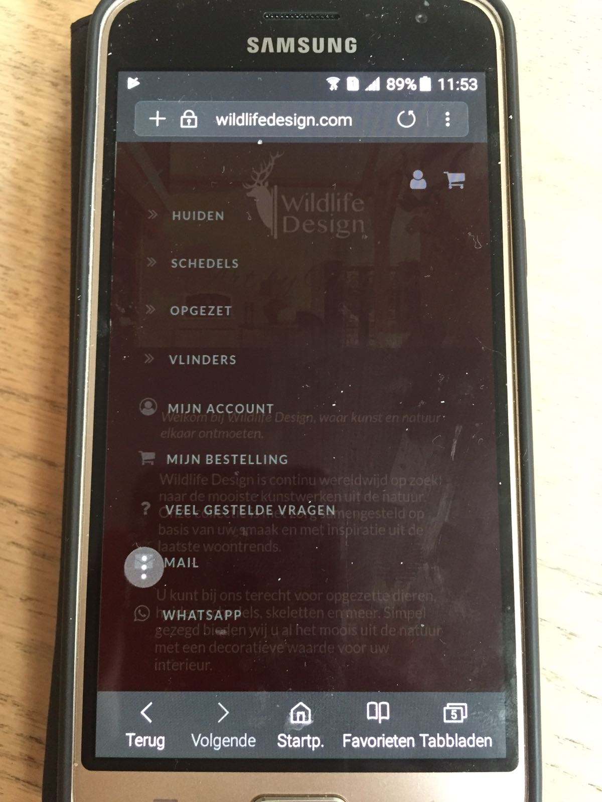
Samsung phone - problem with the button with 3 dots in the design. They are not supposed to be anywhere in the design:
Iphone 6 - Problem with alignment of the hover menu’s (it goes off screen) and the hamburger menu animation is not working:

When I test the site in the backend, everything looks fine. But when testing it live on the devices it doesn’t work like it is supposed to. Also, some devices don’t seem to have the problem(s) and others do. I really can’t tell what it causing the problems since it is so different for these different devices and browsers.
I really hope you can give me some guidance so I can solve this and my client can finally go live with their website. I’ll provide credentials for logging on to the backend in a secure note.
Thanks in advance!

