Columns Same Height - Pro

Hi There

Do I have to use css for this or is there an option in the settings. All the support queries seem to be 2017 and a lot has changed since then and since this is a much required feature I wondered if it had been built in anywhere.

Many thanks.
Hi There,

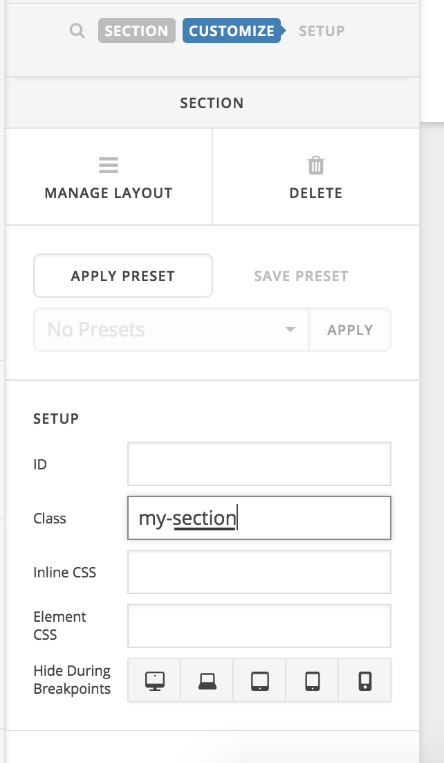
Please add the my-section class to your section:

After that add this custom CSS:

@media (min-width: 768px){
.my-section .x-container {
    display: flex;
}
.my-section .x-container .x-column {
    background: #52b648;
    vertical-align: middle;
}
}

Hope it helps :slight_smile:

Thanks Thai

That has made the boxes same size on desktop. However on mobile the boxes are still different sizes - is that what is intended by the css above. I guess it means that some boxes wont have lots of spare space around!

Hi There,

Please update the previous CSS to this:

.my-section .x-container {
    display: flex;
}
.my-section .x-container .x-column {
    background: #52b648;
    vertical-align: middle;
}

Let us know how it goes!

This topic was automatically closed 10 days after the last reply. New replies are no longer allowed.