ColumnHeight - Image - Text

Hi There

I have a website that is in production and I have a queries which I hope you can help with. I have tried the forum and knowledgebase but unfortunately not found anything that works yet.

I have a section at the bottom of the page under the Testimonial section where there are 3 images. I have created a row with 3 columns and put in the elements of image and text. To get the text to appear in the image correctly I have altered the padding and margins. However, it does not resize properly on smaller screens and I wonder if there is a better way of doing this.
I looked at putting a background image in the column BUT there is only the option to put colour or paralax.

Your advices would be much appreciated.

Thank you

Hi there,

Thanks for writing in.

How do I access your site? I tried correcting the URL with no IP and even with different combinations and it still unreachable. Please provide some intructions.

Thanks!

Hi There Rad

So sorry it looks as though this cannot be viewed outside of my server environment. I will attach a file which shows the images with text over to see if that helps

If not then I will copy the website to one of my other domains which can be viewed properly.

Kind regards

Eileen

Hi there,

Thanks, I think the best implementation of this kind is using a slider with the carousel (carousel will act as the column). Or using any grid add-ons like Essential Grid or The Grid. They have built-in full-responsive features that can maintain good layout for every device. The standard columns will only respond along with its current content, not with contents from other columns.

Thanks!

Hi Rad

I think you misinterpreted what I wanted. I dont want other column contents included what I want is to be able to have one column with an image as a background then have some text over that image. I dont seem to be able to do that.

Any ideas??

Kind regards

Hi there,

What you are trying to do is quite specific and requires a bit of custom code.

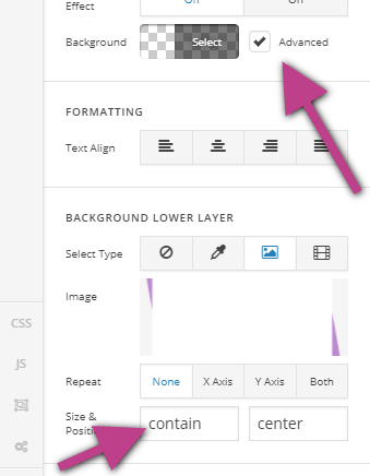
I think it would be easier if you set the purple paper image as the background of the columns then setting the background size to contain.

Then add a class to each column so that you can set a minimum height for each. You can do this by click on the customize option of the column setting.

For example the class name you have added is purplebox, then add this code in the custom CSS.

.purplebox {
    min-height: 300px;
}

Then now, you can add the text element in each column. It would be easier if you place the box title and text in the same text element so that they will be in the same container. Then set the padding for the text element accordingly so that it will fit in the white space of the box.

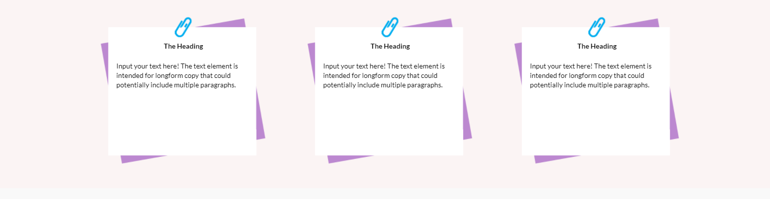
If you’re able to follow the instructions above, you should be able to have a view like this:

But if you check on some mobile views, you might need to set the padding for the purple boxes as they would look misaligned. You can try adding some media queries likes this:

@media (min-width: 768px) and (max-width: 979px) {
  	.purplebox {
  			padding: 35px 0 0 !important;
  	}
}

@media (min-width: 481px) and (max-width: 767px) {
  	.purplebox {
  			padding: 10px 180px 0 !important;
  	}
}

Hope this gets you started.

Cheers!

This topic was automatically closed 10 days after the last reply. New replies are no longer allowed.