My column that reads ‘move in & move out’ is squeezed together on mobile. How do i fix that? It looks fine on desktop.
That’s because you have set a very large padding value for this row as in this screenshot:
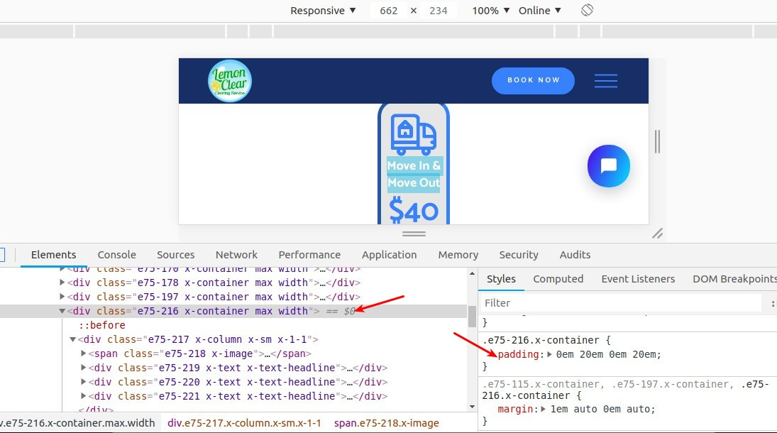
If this is necessary, then I would suggest adding a custom CSS class to this row, then you can target this row on mobile devices using this code:
@media screen and (max-width: 768px)  {
    .custom_class {
	   padding: 0!important;
    }
}
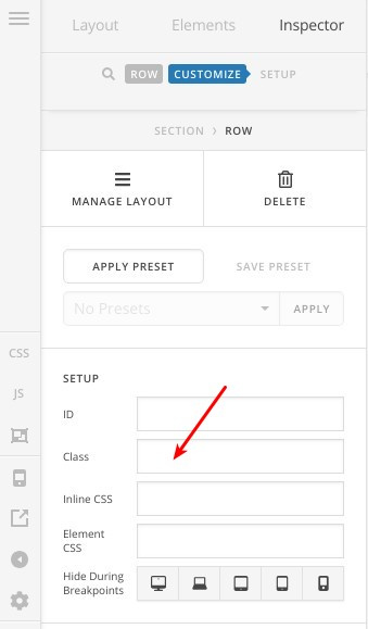
You can add a custom CSS class after selecting this row as in the following screenshot:
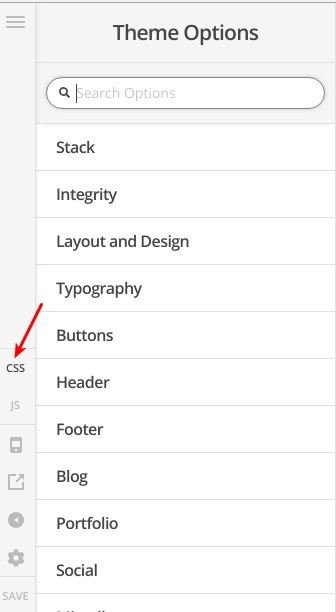
The CSS code can be added (Theme Options > CSS):
Thanks.
This topic was automatically closed 10 days after the last reply. New replies are no longer allowed.